Visit Milwaukee reveals new logo ahead of RNC, other high profile events
More eyes will be on Milwaukee during the next few months than any other time in recent history, which is why Visit Milwaukee is launching a rebrand.
With the current season of Top Chef highlighting different parts of the city and state each week, the Republican National Convention coming in July, and the Milwaukee Bucks in the playoffs, Visit Milwaukee revealed its new logo on Tuesday.
“Going into a new rebrand is always a big challenge and a heavy undertaking,” said Josh Albriecht, vice president of marketing and communications. “Especially when you’re doing a new brand that helps to represent and define a city and community that you live and work in.”
Visit Milwaukee, which promotes tourism to the area, has been working on this new logo for two years, talking to stakeholders and doing surveys. The organization wanted to make it official before the big-time events get underway.
“It’s a very high-profile year,” Albriecht said adding that the opening of the expanded Baird Center adds to the excitement. “Definitely 2024 is 100% the year to do this... to really celebrate and capture the momentum that we have right now in the city.”
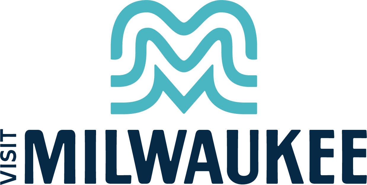
Here's all the messages within the new logo:
What's up with the three lines?
The three lines are meant to look like waves and celebrate the city on the water. It also represents the three rivers (Milwaukee, Menomonee and Kinnickinnic) that flow through Milwaukee.
Why three lines?
Each line represents one of the original towns, Juneautown, Kilbourntown and Walker's Point, that eventually formed to make Milwaukee.
The lines look like the letter M?
There's more than the three most visible Ms in the logo. In the negative space and the larger combined logo there are seven Ms representing the Milwaukee 7 region.
I see a heart!
Hidden in the logo is a heart to represent the passion of the people of Milwaukee.
Each line looks different, is that on purpose?
Yes. The top line is meant to represent the Hoan Bridge, the Mitchell Park Domes and the roof at American Family Field.
The more rigid line is meant to represent the city's area code, 414.
And the lines are meant to look like wings to represent the previous logo, the Milwaukee Art Museum.
This article originally appeared on Milwaukee Journal Sentinel: Visit Milwaukee reveals new logo ahead of RNC, other high profile events
