National Hurricane Center releases new 'cone of terror' to help communicate risks
One of the most scrutinized, and feared, weather graphics in history got a makeover this year as the National Hurricane Center tries to better convey the hazards of a tropical cyclone.
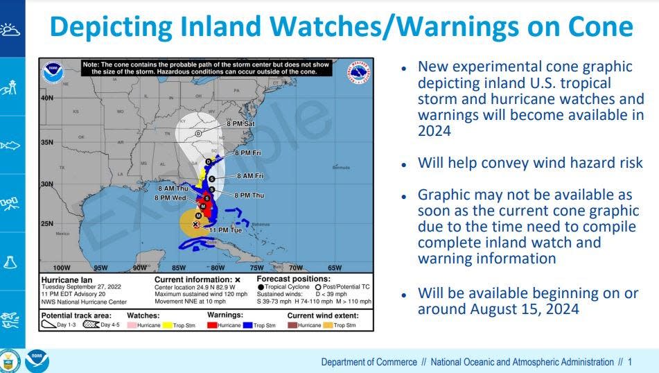
A prototype five-day hurricane forecast cone – a high beam on regions targeted by tropical trouble – will debut in August with color-coded wind watches and warnings that extend inland instead of focusing solely on the coasts.
For example, although powerful Category 4 Hurricane Ian made landfall on the southwest coast of the state in 2022 and cut a lengthy path of destruction through Central Florida, the wind watches and warnings on the cone graphic remained pinned at the coast.
The prototype cone will paint inland areas with the same color-coded watches and warnings.
"This is a step in the right direction of better understanding the risks," said Robert Molleda, warning coordination meteorologist for the National Weather Service in Miami. "As we know, the impacts of a storm spread inland, so this is a truer depiction of the wind threat."
The current iteration of the cone will continue to be used during testing of the new version.
The cone, which was first introduced in 2002, is brilliant in its graphical simplicity.
But that is also its downfall as people fall into the trap of thinking a hurricane's winds, storm surge and flooding rain will fit neatly inside the confines of the fuzzy white funnel, and that the tropical cyclone will track down the middle.
Instead, the center of a storm can track anywhere inside the cone with impacts far afield. Thirty-three percent of the time the storm travels outside the cone.
It's a challenge for the National Hurricane Center, which got so frustrated by people focusing on the "skinny black line" down the center of the cone as the absolute path of the storm, it deleted the line from the main graphic. (You can still manually add the center forecast track line on the NHC website.)
Hurricane season: Fear rain as much as storm surge as climate change increases threat
And the prototype cone also has its limitations. Watches and warnings for flooding rains that can come with a tropical system are not shown on the graphic.
Ian brought rainfall of 10 to 20 inches in parts of Central Florida causing flooding in Seminole, Orange, Lake, Putnam and Osceola counties. The National Hurricane Center’s report on Ian says there were 12 direct deaths attributed to freshwater flooding in central and eastern Florida.
"It doesn't make an attempt to be comprehensive, but it does provide a better understanding of the scale of the threat," said Fox Weather hurricane specialist Bryan Norcross about the prototype map. "It's hard to get a broad understanding of a complex issue in one simple graphic."
Part of the challenge has been that the local offices of the National Weather Service issue the inland watches and warnings, with the hurricane center focusing on the coasts. So, alerts are coming from two different sources on different graphics, and often at a time of heightened urgency. The new map combines the alerts.
“There is a delicate balance between showing useful information and too much information that clutters up the image,” Molleda said.
In 2017, the hurricane center gave the cone a makeover that included shaded areas encircling the center of a storm to show the reach of tropical storm- and hurricane-force winds. It was hoped the change would be a better indication of how far away from the center hazardous winds might exist.
It made it to Cat 5: Ian winds topped 161 mph before landfall, costliest hurricane in state history
A year later, the Hurricane Forecast Improvement Project announced it planned to study the effectiveness of several of the hurricane center's communication tools, including the cone.
Changes to the cone graphic, and all hurricane center communication tools, are heavily researched with focus groups and social scientists studying how best to convey information quickly. In 2019, NHC researchers said the average visitor to the center’s website during an active storm spent just 30 seconds looking at forecast products.
“Everybody knows the cone is misleading to a lot of people,” Norcross said. “There is also an understanding that the cone is so entrenched they can’t get rid of it so the question has been what to do to make it better.”
Kimberly Miller is a veteran journalist for The Palm Beach Post, part of the USA Today Network of Florida. She covers real estate and how growth affects South Florida's environment. Subscribe to The Dirt for a weekly real estate roundup. If you have news tips, please send them to kmiller@pbpost.com. Help support our local journalism, subscribe today.
This article originally appeared on Cincinnati Enquirer: National Hurricane Center releases new hurricane track forecast
