Met Office boss hits back at claims weather maps are ‘being made scary’ as Europe burns
A Met Office boss has hit out at claims from climate-change sceptics that weather maps are being “made scary” as Europe faces potentially record-breaking temperatures.
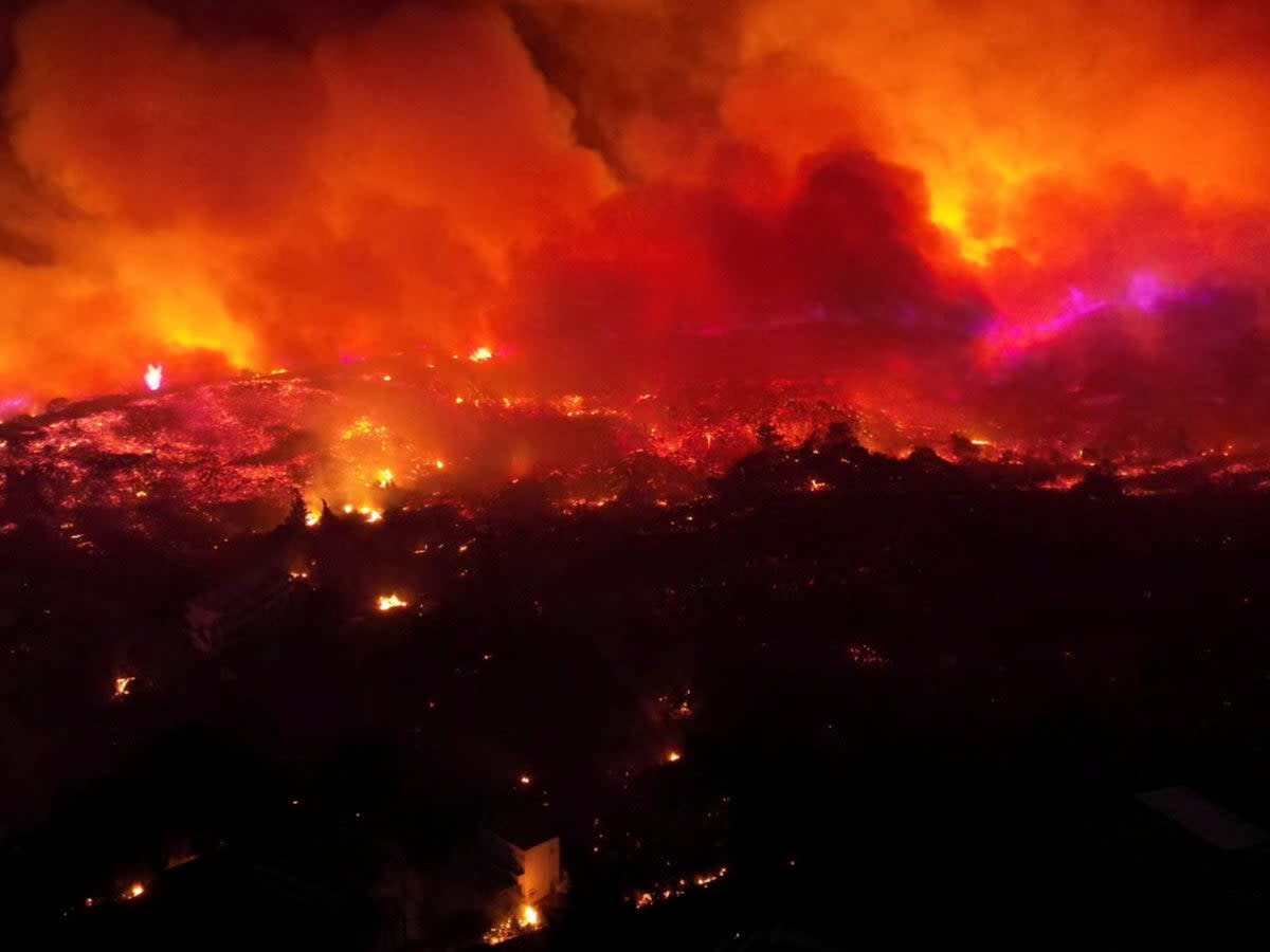
Greece is the latest to see the mercury top 40C, with the islands of Rhodes and Corfu hit by wildfires that have led to mass evacuations as the summer holiday season gets underway.
But Professor Penny Endersby, CEO of the Met Office, said there had been an “upsurge” in people denying the data behind such events as the severity of extreme weather intensifies.
Replying to a monologue by GB News presenter Neil Oliver that accused experts of “blatant fear-mongering”, Prof Endersby tweeted: “There’s been an upsurge of denying the data as the effects grow stronger. ‘You’ve made the map scary, hidden sensors in hot places, reported hotter temperatures than really happened, switched to measuring surface instead of air temp, changed old records to be cooler.’ All false.”
Have you been affected by the fires in Greece? If so email tara.cobham@independent.co.uk
Mr Oliver delivered a segment on Saturday claiming that alternative views on subjects like Covid lockdowns and the Ukraine war had been “silenced” before turning his attention to coverage of the weather.
“The powers that be are busy using the summer as an anvil for the reasons that only make sense when you’re in the business of frightening the living daylight out of populations,” he said.
“The palette for colouring the weather maps has been changed from the familiar, life-affirming greens and blues to the angriest or oranges, reds, purples and black.
“I say it’s ludicrous. Among the blatant and inexcusable fear-mongering deployed so far. The news reporting has been at least as hysterical as the weather forecasting.”
There’s been an upsurge of denying the data as the effects grow stronger. “You’ve made the map scary, hidden sensors in hot places, reported hotter temperatures than really happened, switched to measuring surface instead of air temp, changed old records to be cooler.” All false.
— @MetOfficeCE (@metofficece) July 24, 2023
As part of her response, the Met Office CEO pointed to a series of tweets addressing the presentation of weather maps by Met meteorologist Aidan McGivern.
Posting last July, when the UK faced record-breaking 40C temperatures, he stressed that regardless of the colour the UK was seeing temperatures like never before.
When we designed the new colours, in Autumn 2021, only parts of the Middle East and North Africa were >39 C
I thought these temperatures would turn up occasionally in Spain in the summer
I never expected them to appear on UK maps
7/8 pic.twitter.com/4yjwYxI4MR— Aidan McGivern (@aidanweather) July 17, 2022
Mr McGivern also explained that the Met’s colour scheme for weather maps had been changed in 2021 but only to make them more accessible.
“Unfortunately, the old scale (which used a mixture of blues, greens, oranges, reds) wasn’t accessible for people like me who are colourblind,” he wrote. “So, we changed the temperature colours to make the maps easier for people who are colourblind like me.
“That’s it, no conspiracy.”
