This map shows health disparities for WA census tracts. Check out your town’s health risks
The next time you see a Washington state department award a grant for cleaning up a contaminated site, funding waste management initiatives, or creating programs for clean energy buildings and solar power, know that the departments aren’t just picking the locations for these programs at random.
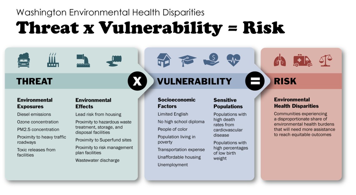
Instead, the state uses the Environmental Health Disparities Map, which helps state departments evaluate health risks in Washington’s 1,458 census tracts.
The map was first launched in 2019 and was just updated with new information on July 28, according to the University of Washington, which helped create the resource.
“The original request for this map tool came from community members who felt that researchers and government programs were looking at either air or water quality, treating them as separate,” Esther Min, a University of Washington researcher who led to the creation of the map, stated in a news release late last month.
State agencies such as Ecology, Commerce and Natural Resources have all used the interactive map in the past to help them determine what areas would benefit most from projects that would improve the health of residents and the environment in an equitable manner.
“But communities experience them together,” Min continued, “and so they wanted to know if there was a better tool that could communicate the cumulative impact of pollution.”
The default overlay on the map ranks each tract on a scale from 1 to 10 — 10 being the highest risk — on the overall health disparity, which considers the four subsections of environmental exposures, environmental effects, socioeconomic factors and sensitive populations. Any user can refine the information by selecting from a menu that includes factors like lead exposure risk and diesel pollution.
Each subsection also breaks down into specific risk factors, such as ozone concentration, the lead risk from housing and unemployment percentages.
Many tracts on the east side of Puget Sound, such as around the Tacoma and Seattle areas, rank in the 8 to 10 range. In the Yakima, Tri-Cities and Spokane regions, there are also many tracts that rank at a higher risk level.
“It brings together not just the harms to communities from pollution through an environmental health lens, but also shows a community’s vulnerability — what makes certain communities less resilient to environmental degradations,” Min states. “The map does a really good job of framing that and communicating that.”
