Is the hurricane forecast cone outdated? Major changes on the horizon


One of the most distinguishing images of the annual hurricane season is the classic forecast cone map. As a storm brews, millions of people rush to see the latest cone map in the days ahead of its forecast arrival.
But do those millions of people understand what they're looking at?
Potentially not. And for that reason, hurricane experts think it may be time for a change.
"A redesign is long overdue," veteran AccuWeather hurricane expert Dan Kottlowski said.
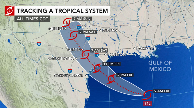
 |
An example of an AccuWeather storm forecast cone track map. |
The topic of a redesign was discussed by meteorologists at the National Hurricane Center (NHC) this spring, Kottlowski said, and researchers from Florida State are spearheading the efforts to better understand how the forecasts can be most effectively communicated.
For that, they need to hear from the people most directly affected.
"A team at Florida State University's Meteorology Department, in consultation with the National Hurricane Center and others, is asking for the public's reaction to various ideas on how the cone could change," hurricane expert Bryan Norcross said in a Facebook post. "They also want to know how people interpret the cone as [it] stands today."
 |
A hurricane cone forecast released by the National Hurricane Center in 2002, the first year these cone graphics were made public. The above graphic was used to predict the track of what would become Tropical Storm Arthur that year. (NOAA) |
Kottlowski added that the information gathered will help the NHC better understand how people use the cone and other products they issue so that they can be in a better position to make changes. However, the process to make those changes will take considerable time.
Norcross has been nationally recognized as one the leading hurricane experts for decades and is remembered for his life-saving forecasts during Hurricane Andrew in 1992. For those forecasts, he received a plethora of awards, including the 1993 David Brinkley Award for Excellence in Communication.
Decades after his historic forecasting communications, however, the scope of the forecasting cone has shifted and the clarity of its message has been lost on some. What does the track forecast cone signify?
Every year, the NHC adjusts the size of the cone to account for the average forecast errors in past years, leading to a thinner and thinner cone as errors have decreased.
However, that thinning of the cone has warped the public's understanding, and thus preparation, for how the hurricane might impact a region.
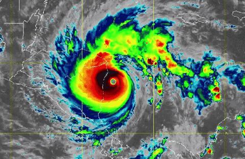
 |
The above animation shows a visible satellite and infrared view of Hurricane Iota as it approached and ultimately made landfall in Nicaragua in 2020. (NOAA/GOES-East) |
"Now, the cone is so narrow that most often bad weather occurs outside of the cone. 'Am I in the cone?' is no longer a good question, not that it ever was a 100% guarantee of safety," Norcross said. "Still, when the cones were fat, the most dangerous weather often fell within the cone, which made the messaging fairly simple."
Kottlowski, with his decades of tropical storm mastery, agreed with that danger, saying that many people use the outer limits of the cone to make their own personal decisions on how to react to an approaching storm -- which isn't how the cone was intended to be interpreted.
Essentially, Kottlowski said, people think that if they aren't in the forecast cone then they don't have much to worry about.
"Since the cone is ONLY for track and wind, it does not indicate the other hazards of storm surge, flooding rainfall and tornadoes," he said in an email. "In fact, more people die from water than the wind. So, a redesign is long overdue."
A lot has changed in the decades since the cone's emergence. The media revolution by way of the internet, smartphones and social media has crafted a new audience with different needs.
"Now that the cone is narrow, more explanation is needed," Norcross said. "In an era of cellphones and abbreviated communications, explanation is often in short supply. So the time has come to rethink how the cone is made, and maybe the cone itself."
As Kottlowski previously said, an expansion to the cone to more broadly highlight impacted areas could be an important addition. This future graphic could include another barrier line or shaded area outside of the cone to indicate impacts. Or it could use an entirely different approach using colors and shading, he said.
 |
AccuWeather |
However, he emphasized, the process for any change that may come along will certainly not happen overnight. Millions of dollars are being spent by the NHC to conduct nine different projects to gather social science information.
"I would not expect any big changes to take place for at least a few years," Kottlowski said. "[The] NHC has a goal to have some experimental products come on board during the next five years and hopefully have all products and new products up and running full time by 10 years from now."
During his Hurricane Andrew coverage, Norcross unveiled a graphic he had been working on for a couple of years. The graphic showed the width of an upcoming hurricane based on NHC forecast information, with a rough estimate of the average errors at 24, 48 and 72 hours in the future.
"At that time, the graphics software we used did not allow the cone to be drawn in the ice-cream-cone shape that we use today, but at least the idea that errors increased with time was clear," he said.
CLICK HERE FOR THE FREE ACCUWEATHER APP
A few years later, an updated software allowed for colors to be added to Norcross's cone. By 2002, the NHC was distributing those graphics to the public, first with Tropical Storm Arthur.
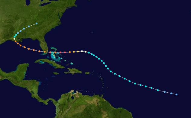
 |
In 1992, Hurricane Andrew slammed the eastern coast of Florida as a Category 5 hurricane. The image above shows its track throughout its lifespan. |
But the history of the hurricane cone goes much farther back, Norcross wrote.
"It turns out, the Japanese Meteorological Agency used a conelike graphic as early as the 1950s, and a brilliant NHC programmer and meteorologist named Charlie Neumann published papers showing error ellipses for hurricane forecasts, which were sort of like a cone, in the late 1970s and 80s," he said. "But in those days before the internet, they didn't get widespread distribution, and forecasts for the public were just points on a map, and occasionally a fan with color-coded probabilities."
Now, more than 70 years after its original rendition, that cone has received more widespread distribution than its creators might have ever imagined. With an evolving relationship between communicators and audiences, the way that cone will soon be portrayed will be reimagined.
Keep checking back on AccuWeather.com and stay tuned to the AccuWeather Network on DirecTV, Frontier, Spectrum, FuboTV, Philo, and Verizon Fios.
