These Are the Neutral Paint Colors Interior Designers ACTUALLY Use
"Hearst Magazines and Yahoo may earn commission or revenue on some items through these links."
In the wonderful world of interior design, where colors compete for attention and trends change as swiftly as the seasons, there are quiet heroes that maintain their timeless appeals: Neutrals. A far cry from being bland or boring, neutrals are the unsung champions of the design world, providing a serene backdrop for bold accents or bestowing a minimalist, elegant aesthetic all on their own. But while it may seem like you can never go wrong with a neutral—after all, the palette is known for its endless versatility—selecting the wrong undertone can throw off your room’s vibe.
So, where to begin? First, you’ll want to think about the room itself. Are you looking for warm or cool tones? Will you be incorporating any accent colors? Does the room have ample natural sunlight? Once you’ve set these parameters, it’s time to pick your ideal shade. Fortunately, dozens of interior designers have revealed to us the neutral paint paint colors they use in bedrooms, bathrooms, and beyond. With an expansive assortment of taupes, grays, and off-whites to choose from, the colors featured below can happily take center stage or fade into the background. Because, at the end of the day, isn’t the best neutral one that can change to your evolving needs?
Benjamin Moore Cotton Balls OC-122
“When a room calls for a versatile backdrop, I turn to the timeless elegance of white. Cotton Balls, with its subtle infusion of yellow, adds a warm glow that effortlessly embraces any decor style.” —Rayman Boozer, Apartment48
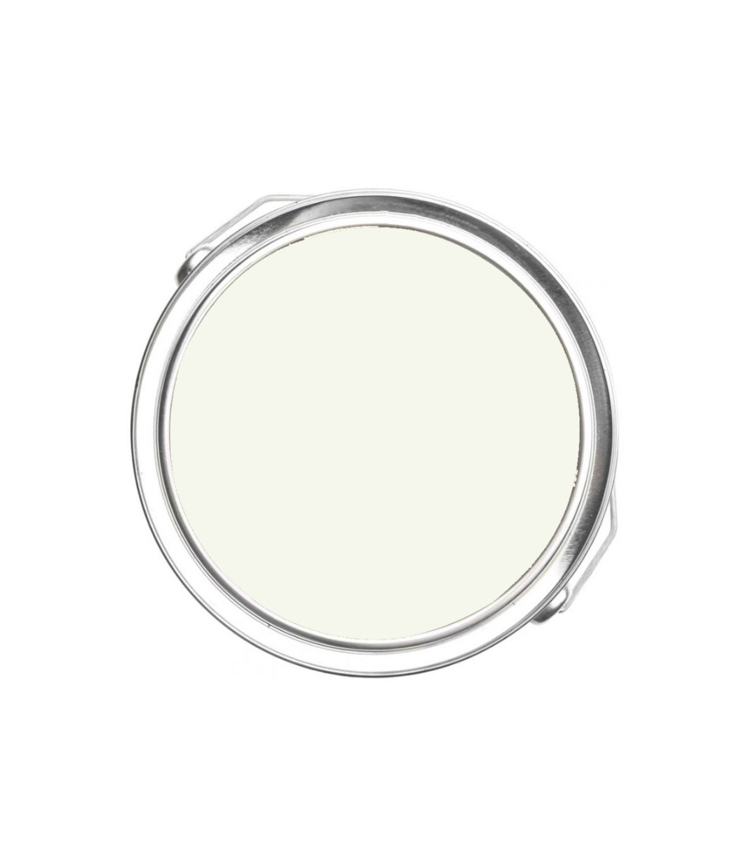
Farrow & Ball Slipper Satin
“Slipper Satin by Farrow & Ball has become one of our most beloved colors in recent years—we find it to have just enough pigment to give rooms the right amount of depth without being too overpowering. We’d call this color ‘neutral adjacent.’” —Jean Liu
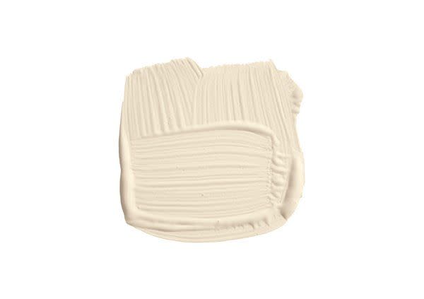
Benjamin Moore Abalone 2108-60
“While I typically steer clear of beige, there is one exception that I’ve grown fond of: Abalone. With its hints of gray complemented by a subtle blush of pink, this color surprises and delights, proving that neutrals don't have to be boring.” —Rayman Boozer, Apartment48
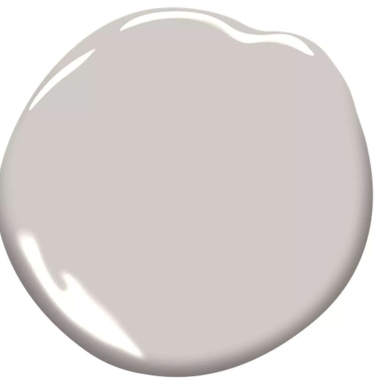
Mt. Rainer Gray Benjamin Moore 2129-60
“I love Mt. Rainier Gray in Benjamin Moore’s Matte Regal Select collection. The icy blue tones with touches of gray resemble the sky, imbuing any space with a sense of calm. Mt. Rainier Gray is an ideal backdrop for any style that sparks joy in one’s life,” —Courtney McLeod, Right Meets Left Design
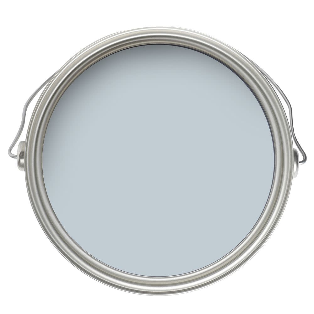
Sherwin-Williams Playa Arenosa SW 9094
“This color is a warm cafe latte colored hue—a beige with the slightest pink tones in it. It’s a warm hug! Super soothing but never dull.” —Ghislaine Viñas

Benjamin Moore Metropolitan AF-690
“Metropolitan by Benjamin Moore is always a go-to warm gray for me. I wanted to create a moody environment, especially in the bedroom. The color conveys a sense of calm modernity.” —Courtney McLeod, Right Meets Left Design
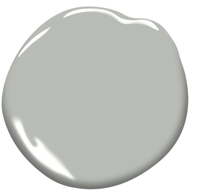
Sherwin-Williams Iced Mocha SW 9092
“Iced Mocha is an aptly named color since that’s exactly what it looks like. There’s a tint of pink in this color, making [it] both soft and inviting. I’m not one know for working in beige or brown color palettes but [this neutral] feels fresh and modern to me.” —Ghislaine Viñas

Benjamin Moore Havana Tan 1121
“This tan is just so rich and pretty. It has some pink undertones so it feels warm and enveloping while still serving as a great backdrop for art and furnishings.” —Jessica Davis, Atelier Davis
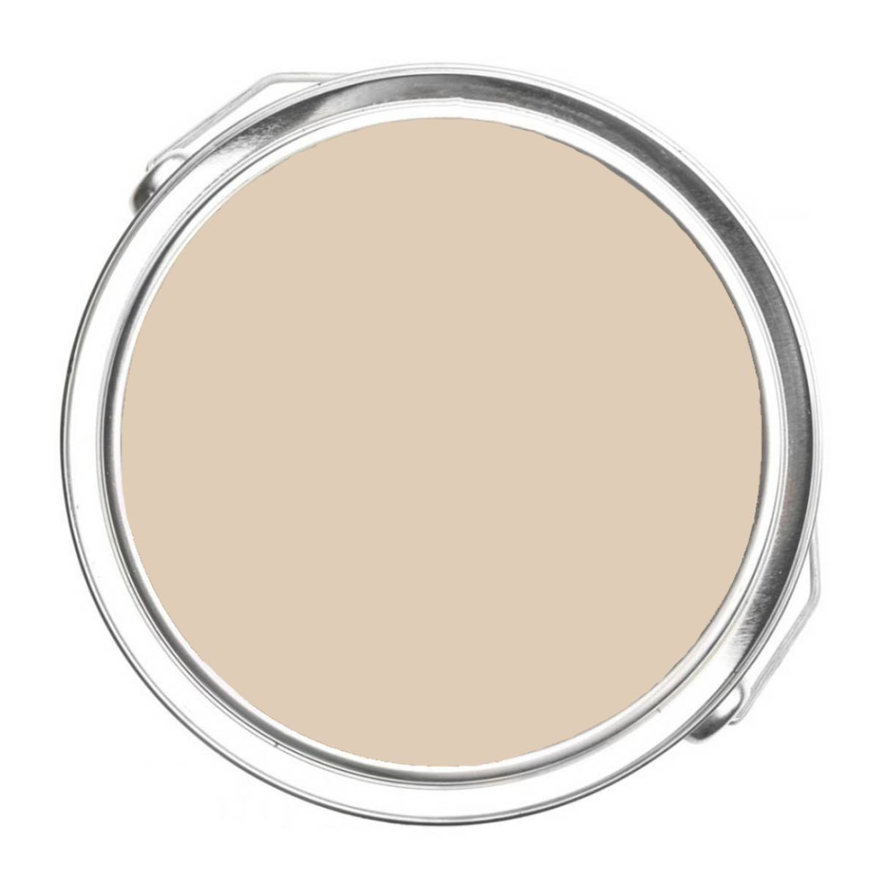
Clare Turbinado
“Beige is back, baby! Dreaming up projects using earthy, plaster-inspired walls and Clare Paint in Turbinado is giving me all the neutral vibes. Bonus points for being earth-friendly and Black, female-owned company!” —Lori Paranjape, Mrs. Paranjape
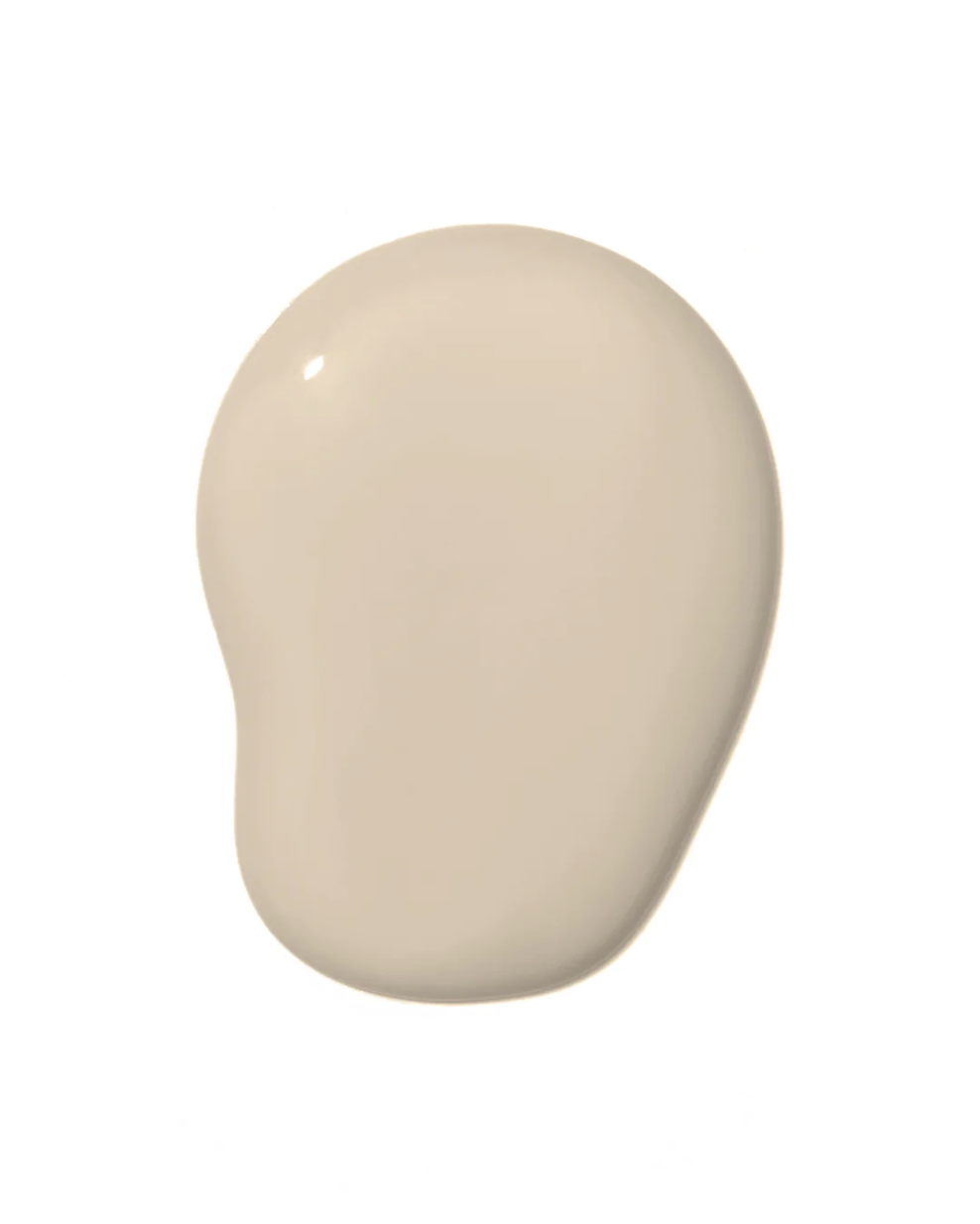
Paean Black by Farrow & Ball
“I’m always looking to pair our wallcoverings with the perfect paints that highlight our designs. Farrow & Ball has the most gorgeous velvety black shade that looks extraordinary paired with our Dahling [wallpaper] in charcoal. We highly suggest painting the ceiling and crown molding in this deep dark color to make the paper pop.” — Melinda Marquardt, The Vale London
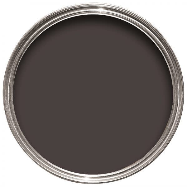
Table Linen by Portola Paints
“Table Linen on its own has a bit of a creamy, almost yellow undertone that, when paired with bright white, might feel too buttery. When you pair it with deeper, more saturated colors like Figueroa and Piano Room, it cuts all the yellow out and it just feels like a warm white.” — Jamie Davis, Portola Paints
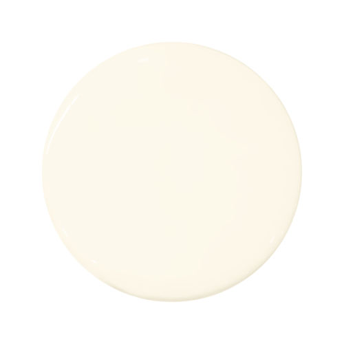
Manchester Tan by Benjamin Moore
“A go-to warm neutral that is a wonderful chameleon color. It can go modern or traditional and pairs easily with textiles for window treatments. I have had it in my living room for 11 years, and it still feels fresh.” — Marika Meyer
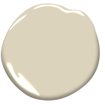
Silver Satin by Benjamin Moore
“It has the slightest hint of gray and beige together; it adds a lot of depth and body to a space while still feeling neutral.” — Rebecca Hay
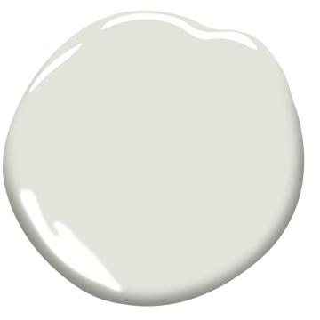
Shaker Beige by Benjamin Moore
“This neutral paint color is the perfect backdrop to allow the art to take center stage. We recently used it in living room, and it complements the rusts and greens in the artwork perfectly.” — Marguerite Rodgers
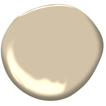
Harbor Gray by Benjamin Moore
“Finding a good neutral color can be tricky. Benjamin Moore’s Harbor Gray is one of my go-to grays because it is such a great middle ground between a warm and a cool gray. It works with everything!” — Rozit Arditi, Arditi Design
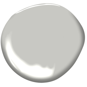
Benjamin Moore Lost Locket CSP-410
"When it comes to bedrooms, I want them to be soothing and calming. Lost Locket is such a soft and dreamy color that we can't get enough of it for bedrooms." —Rozit Arditi
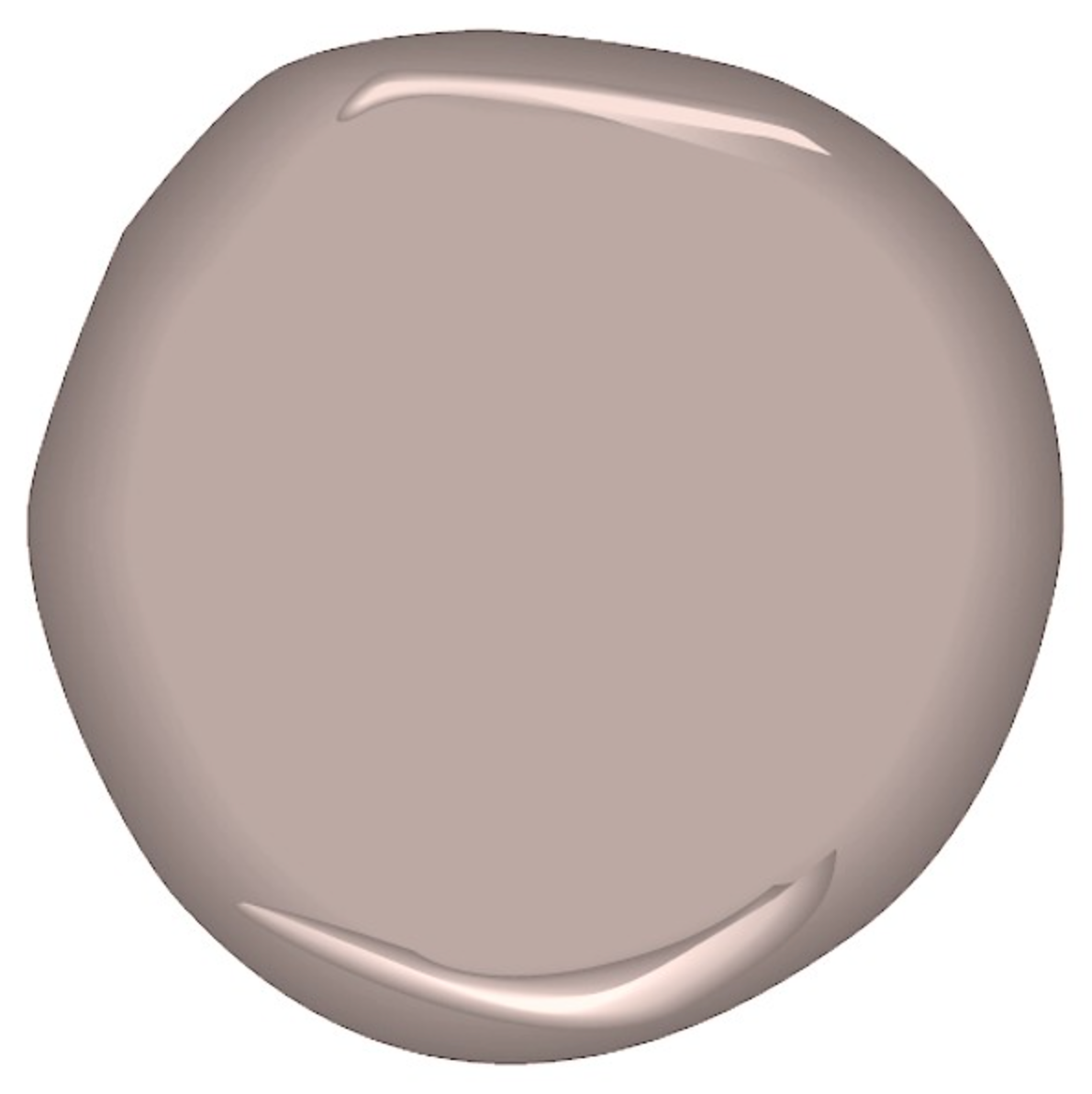
French Canvas by Benjamin Moore
“It’s the perfect neutral; it has a green undertone that makes it pair well with so many colors, and there is an organic feel to this neutral. It’s not boring.” — Isabel Ladd
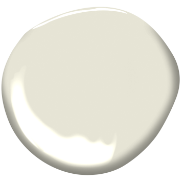
Navajo White by Benjamin Moore
“Navajo White is the best in the beige family. It doesn’t have an undertone of pink, yellow, or green like so many neutrals can have.” — Carolynne Kollar-Flanagan, Mojo Stumer
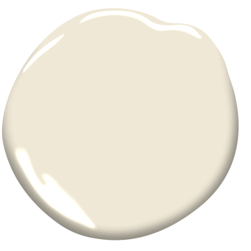
Ammonite by Farrow & Ball
“Neutral can go in so many directions, but for me, it’s about how the color reflects, absorbs, and accentuates natural light in a room. This is a chameleon of color that can appear like a creamy off-white one minute, and a very pale gray-blue the next. I love when a paint color surprises you from hour to hour and almost adapts to its surroundings.” — Jeff Andrews
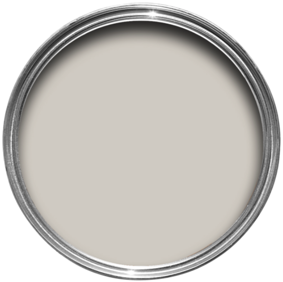
Cedar Key by Benjamin Moore
“Benjamin Moore’s Cedar Key is one of my favorite neutrals in both brightly lit and moodier rooms. It’s a versatile neutral that is like a warm hug—cozy, and inviting. Truer whites can feel sterile sometimes, and this warmer off-white mitigates for that.” — Clara Jung, Banner Day Interiors
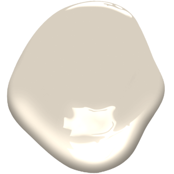
Purbeck Stone by Farrow & Ball
“This greige color can live in so many places. It’s warm but not yellowy. It’s got depth but presents itself quietly. It adds a coziness you didn’t know you needed.” — Sara Barney, BANDD Design
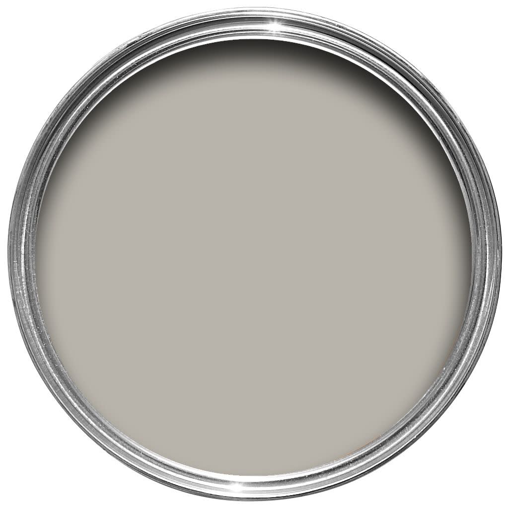
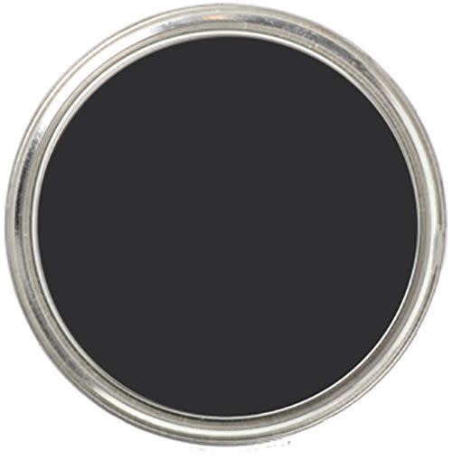
Tricorn Black by Sherwin-Williams
“Tricorn by Sherwin-Williams is a perfect neutral that provides the perfect contrast for gold or silver hardware finishes. This is ideal for me as a designer, as no two clients desire the same look in their spaces. I can apply Tricorn without the worry of any selected hardware clashing because of varying undertones. This paint color isn’t just neutral, it’s extremely versatile.”— Breegan Jane
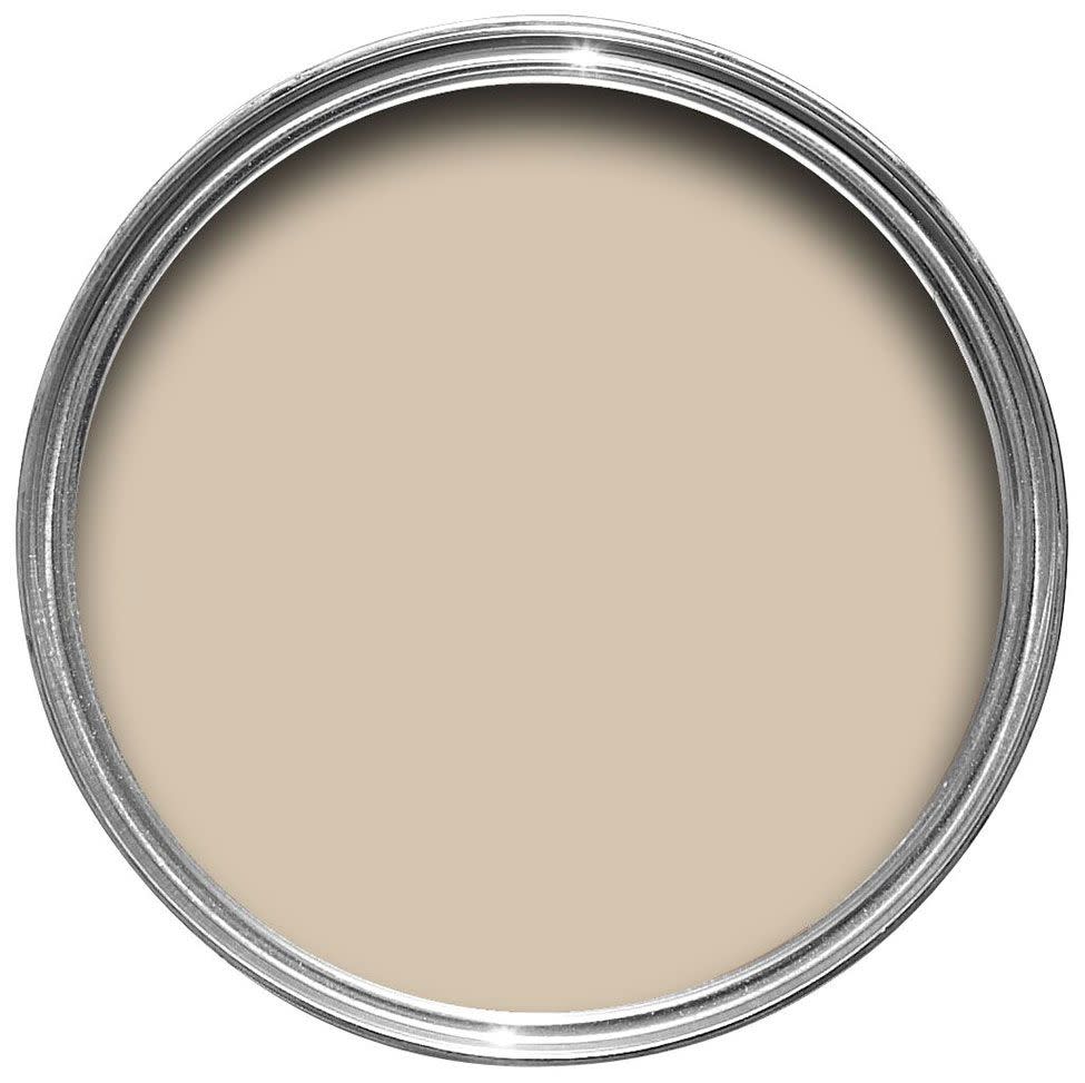
Bleeker Beige by Benjamin Moore
“Who says ceilings have to be white? We love to tone ceilings down with warmer neutral tones. However, beige can be very tricky, as it can hue pink, yellow, or even green as light travels during the day. It’s a big disappointment to choose a paint color to find it turns very yellow in the afternoon light. Benjamin Moore’s Bleeker Beige is the perfect beige that holds true in sunlight and is subtle and highly adaptable." — Kendall Wilkinson

Joa's White by Farrow & Ball
“Joa’s White is the cashmere of neutrals. It’s soft, and has a luxurious feel when it’s paired with leathers and metals with a patina. I love a neutral with red undertones.” — Corinne Mathern
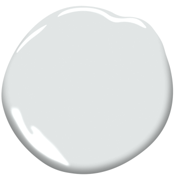
Marilyn’s Dress by Benjamin Moore
“I think a delicate pale gray like Marilyn’s Dress can create an extremely sophisticated and elegant foundation for a home. It serves as a chic backdrop for artwork, furniture, and exquisite collections of any sort.” — Allison Babcock
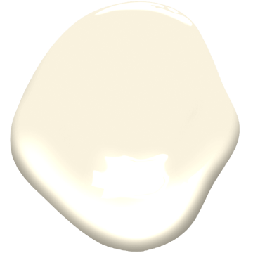
Ivory Tusk by Benjamin Moore
“Ivory Tusk by Benjamin Moore has a very warm, earthy hue. I recently used this in a home where the client’s raffia wallcovering had seen better days and was bleached by the sun. Instead of removing the raffia, we painted over it with this creamy ivory for an instant refresh.” — Tara McCauley
Neutral Ground by Sherwin-Williams
“Neutral Ground by Sherwin-Williams is a go-to for our team. It works so well in an open concept layout and is a great foundation color to use for a layered design. It reads as a really light gray and adds just the right amount of subtle color to walls, particularly for rooms with a lot of windows that offer plenty of natural light. This is a paint color that works well with any palette and for that, we’d consider it ‘gold.’” — Janelle Hughes and Kim Williams, KJ Design & Mortar Styling LLC
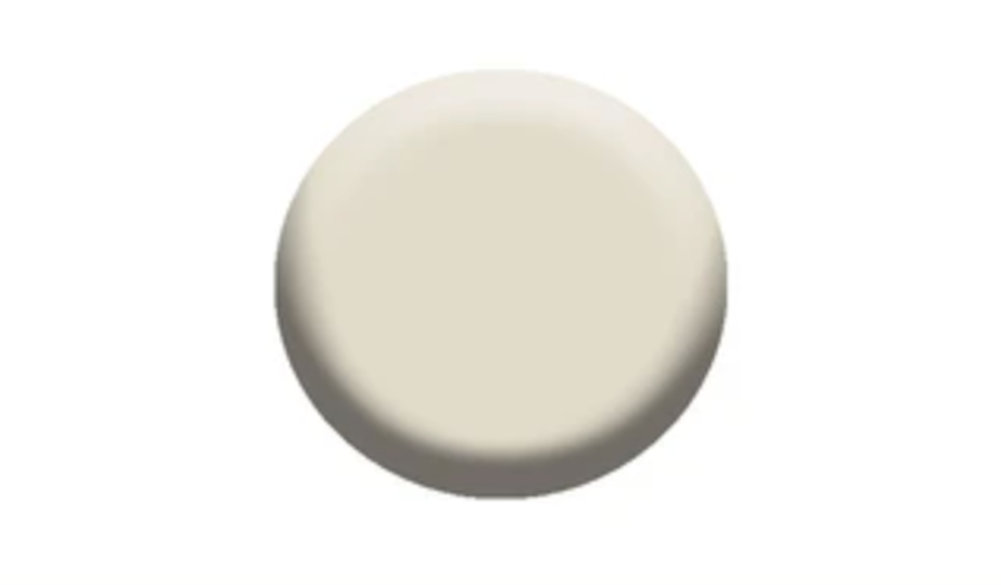
Gray Owl by Benjamin Moore
“Benjamin Moore Gray Owl is one of my go-to paint colors for residential interiors. It has just the right amount of color to stand out when accompanied by any style or color of millwork and contrasts beautifully with white architectural trim as well as various natural stones.” — Sara Ianniciello, director of design at Whitehall Interiors
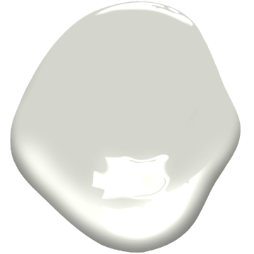
Balboa Mist by Benjamin Moore
“We just discovered Balboa Mist by Benjamin Moore. This neutral creates a perfect dialogue with wood floors and natural fiber upholstery and rugs.”— Silvia Kuhle, Standard Architecture
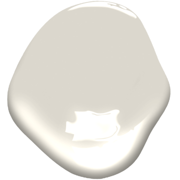
Atrium White by Benjamin Moore
“Atrium White by Benjamin Moore is a shade we come back to time and time again for a neutral backdrop. We use this color in every room of the house because of its unique quality that reflects the cool tones of natural light when shown against it.” — Gioi Tran, Applegate Tran Interiors

Smoke Embers by Benjamin Moore
“Benjamin Moore’s Smoke Embers is the perfect gray with a lot of warmth that is like curling up with your favorite cashmere throw!” — Zandy Gammons and Liles Dunnigan, The Warehouse Interiors
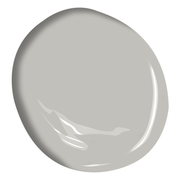
Snowbound by Sherwin-Williams
“My go-to neutral paint color is Sherwin-Williams’ Snowbound. While it may seem ordinary, it’s actually wonderfully unique because this shade of white has zero yellow or blue undertones. That is hard to find in a pure white without looking utilitarian. This color gives us a clean and blank canvas to work with on the furnishings. We don’t have to worry about anything clashing with the walls, and we will will achieve a modern and minimal look.” — Traci Connell
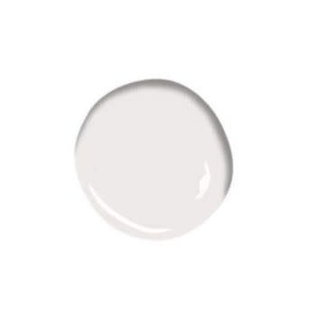
Platinum Gray by Benjamin Moore
“On one of our current projects located in a 1910 historical building, I just used Benjamin Moore Platinum Gray on the walls in the kitchen. It’s a wonderful neutral that errs on the side of a French gray. Pair that with a bright white such as [Benjamin Moore’s] Chantilly Lace and the result will be quiet yet stunning!” — Barry Goralnick
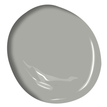
Light Pewter by Benjamin Moore
“I’ve been using Light Pewter since the dawn of time and I consider it a secret weapon in my arsenal of paint colors. Both natural and artificial light reflect handsomely off of this color, making it an excellent choice for an open concept home.” — Patrick Ediger
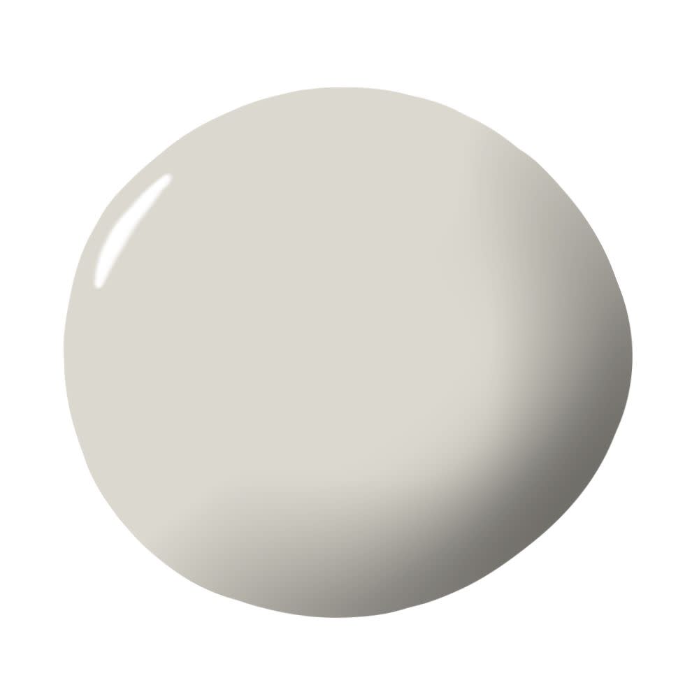
Timeless by Clare
“The name of the paint color says it all. I love a timeless neutral that doesn't sway too trendy or too dated. This is the right color for a backdrop that complements your ever-evolving design style.” — Taniya Nayak
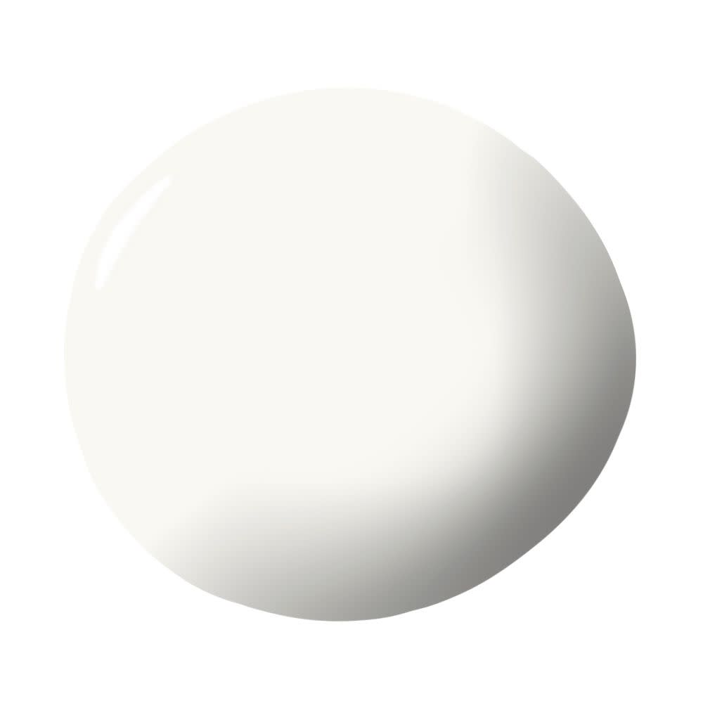
Sterling by Benjamin Moore
“Benjamin Moore's Sterling is a fantastic go-to gray. It is soft with cool undertones, reminiscent of the seashore dusk or an urban cityscape, so works well in both contemporary and traditional settings.” — Emilie Munroe

Revere Pewter by Benjamin Moore
“My go-to neutral is Revere Pewter by Benjamin Moore. Truly a chameleon paint, it can read gray, but with enough warmth in its undertones, that it never feels cold. It's an excellent choice for when you want color on the walls that will play well with almost anything you place next to it.” — Amy Sklar
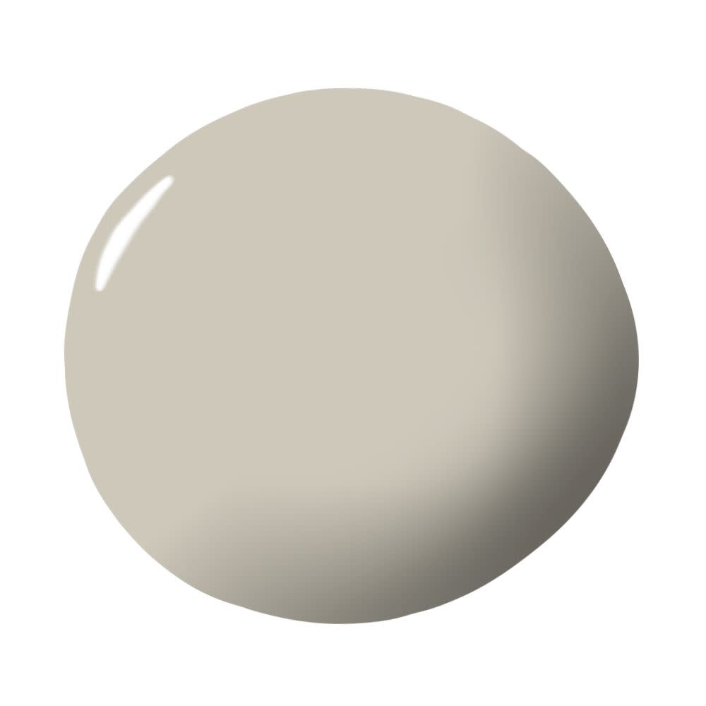
Snowfall White by Benjamin Moore
“Benjamin Moore's Snowfall White is my go-to in life. There’s something about this shade of white that has the perfect amount of warmth to it, and when paired with wood floors, it creates a clean and bright backdrop, giving the space an instant facelift.” — Lauren Buxbaum Gordon
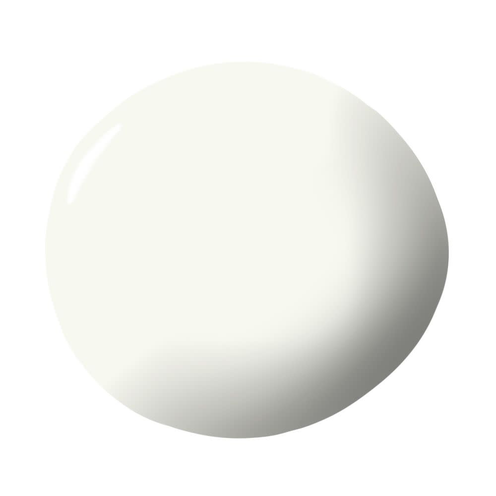
Wind's Breath by Benjamin Moore
“The entire main part of my home is this color. It’s the perfect light greige—not too warm and not too cool. I get asked what it is constantly!” — Erin Gates
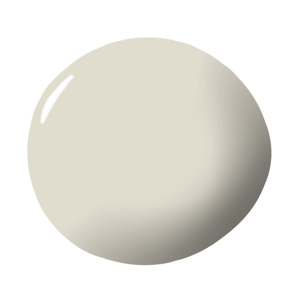
Cornforth White by Farrow & Ball
“Personally, Cornforth White by Farrow & Ball is hands down my favorite. It has this comforting neutral/grayish tone that’s perfect for almost any room. I recommend it to clients who want some drama, but in a soft relaxing way that's easy on the eyes.” — Jessie Schuster
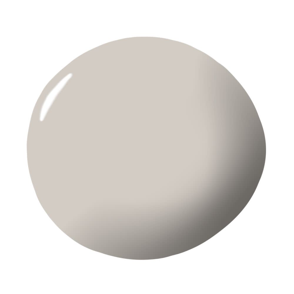
Silver Chain by Benjamin Moore
“Neutrals are so much more than their name implies. They're the base that keeps the whole look together. Gray has always been my favorite color since I was a teenager, and finally, the whole world caught up to me! From Dior gray to rich gray flannel, I’m a fan. This Benjamin Moore gray is dreamy and literally works with any color.” — Penny Drue Baird
"We like using Silver Chain by Benjamin Moore as a neutral because it is a warm grey that adds beautiful depth to any space. We’ve used it as a house color throughout several projects, but a tip we like to share is to lighten the ceiling shade by 50 percent." —Alicia Cheung, Studio Heimat
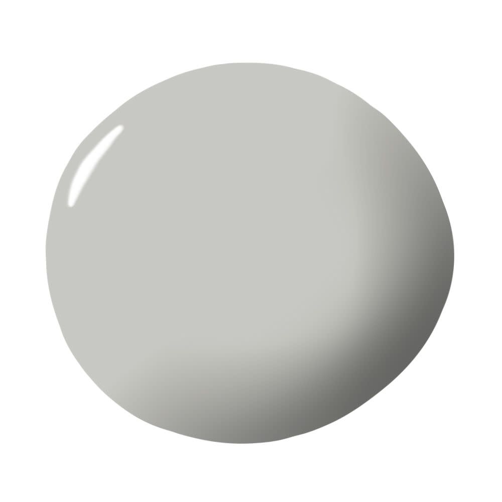
Campfire Ash by Behr
“This color works beautifully if you want to have a slight contrast, but not a stark one. It can blend in with the background, but will be distinct against a white. It makes white colors pop more and look brighter, or can help make a space less sterile by warming it up and feeling like spring. I like using this color for open floor plans to help make the space feel inviting.” — Linda Hayslett
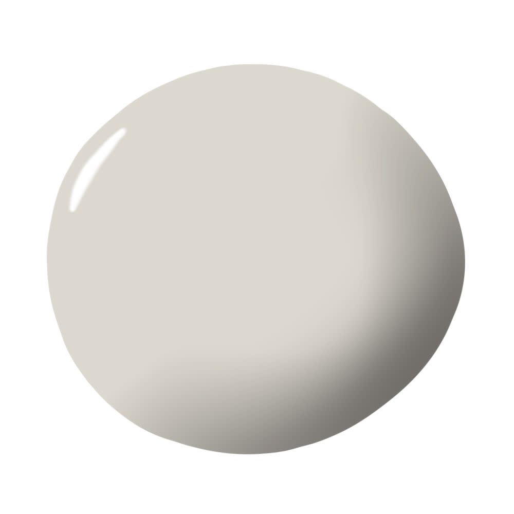
Silvery Moon by PPG Paints
“I love that this color can pull cool tones as well as warm tones, depending on what’s put in the room with it. It’s so versatile, yet doesn’t fight other finishes, just enhances them. By far one of my all time go to neutrals, especially with a dove gray wood floor! Who wouldn’t want a Silvery Moon 24/7!” — Kari Whitman
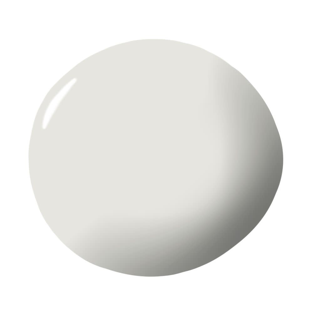
Penthouse by Clare
“I just painted my living room this color and it feels so airy and refined. I always opt for beautiful, pale neutrals as a go-to choice over whites, because they make a space feel clean and bright without feeling stark. Penthouse is an ultra-light gray that’s the perfect mix of warm and cool, with an understated vibe that brings a sophisticated look to any space.” — Nicole Gibbons
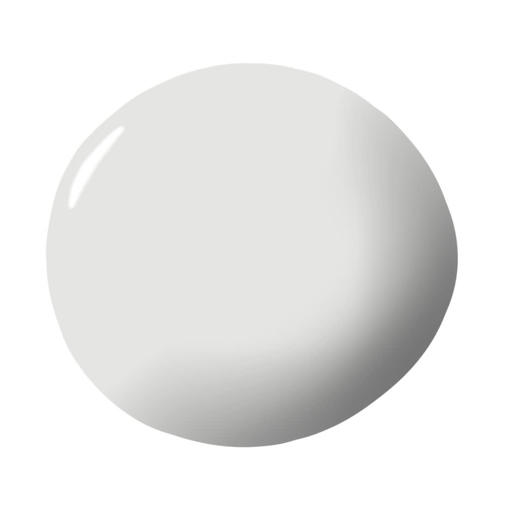
White Dove by Benjamin Moore
“Benjamin Moore's White Dove is a go-to for us. It works beautifully in both traditional and modern homes, and has a lot more depth than some of the brighter whites.” — Christine Markatos Lowe
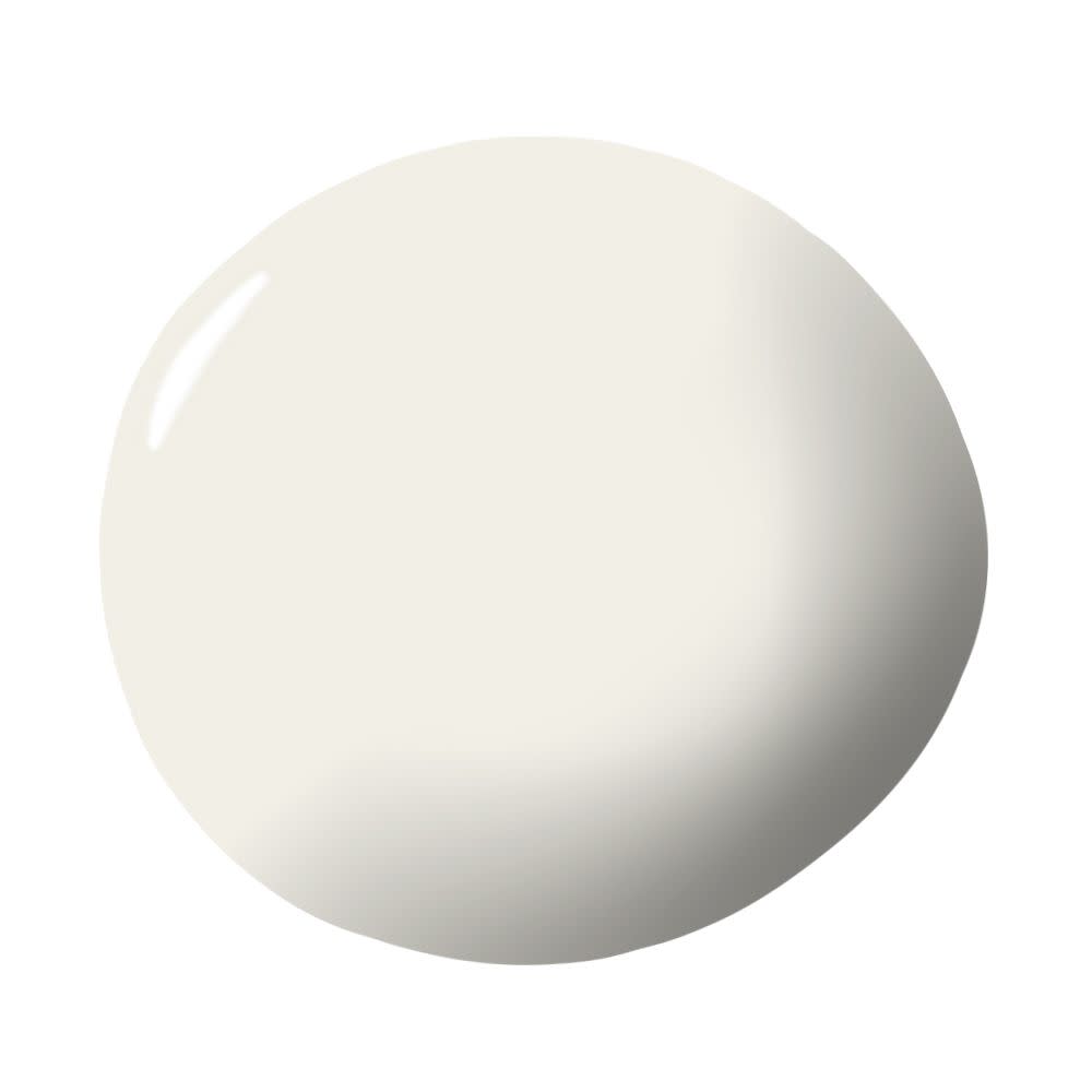
Elephant's Breath by Farrow & Ball
“It's a gorgeous mid-gray that can either be paired with stronger dark colors to create an earthy vibe or a softer white to create a calm environment.” — Liana Reid

Feather Down by Benjamin Moore
“I love this neutral color because it is subtle and warm and works beautifully with everything. It is my go-to neutral hue.” — Shelley Johnstone
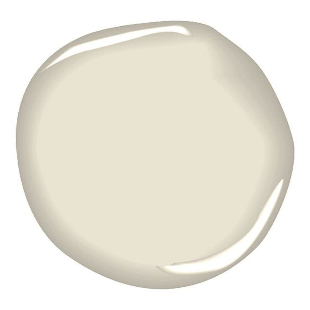
Swiss Coffee by Dunn Edwards
“Especially when working with a vintage or historic home, it’s important to select neural paint colors that fit within the home’s character. Dunn Edwards' Swiss Coffee has been a favorite, as it’s clean and crisp, without feeling too stark. It picks up shadows beautifully and its reaction to light creates beautiful depth.” — Katie Hodges
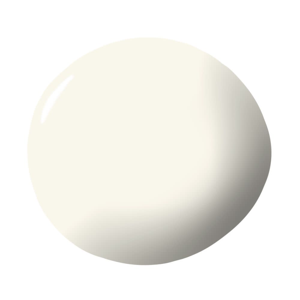
Cloud Cover by Benjamin Moore
“When it comes to the best neutral color, I tend to stick with my tried and true, Cloud Cover by Benjamin Moore. I've used it in several applications, including my own living space and it has the perfect feather-like hue without being too beige or too white. It's cool enough for a more contemporary space, but warm enough not to be sterile.” — Bradley Odom
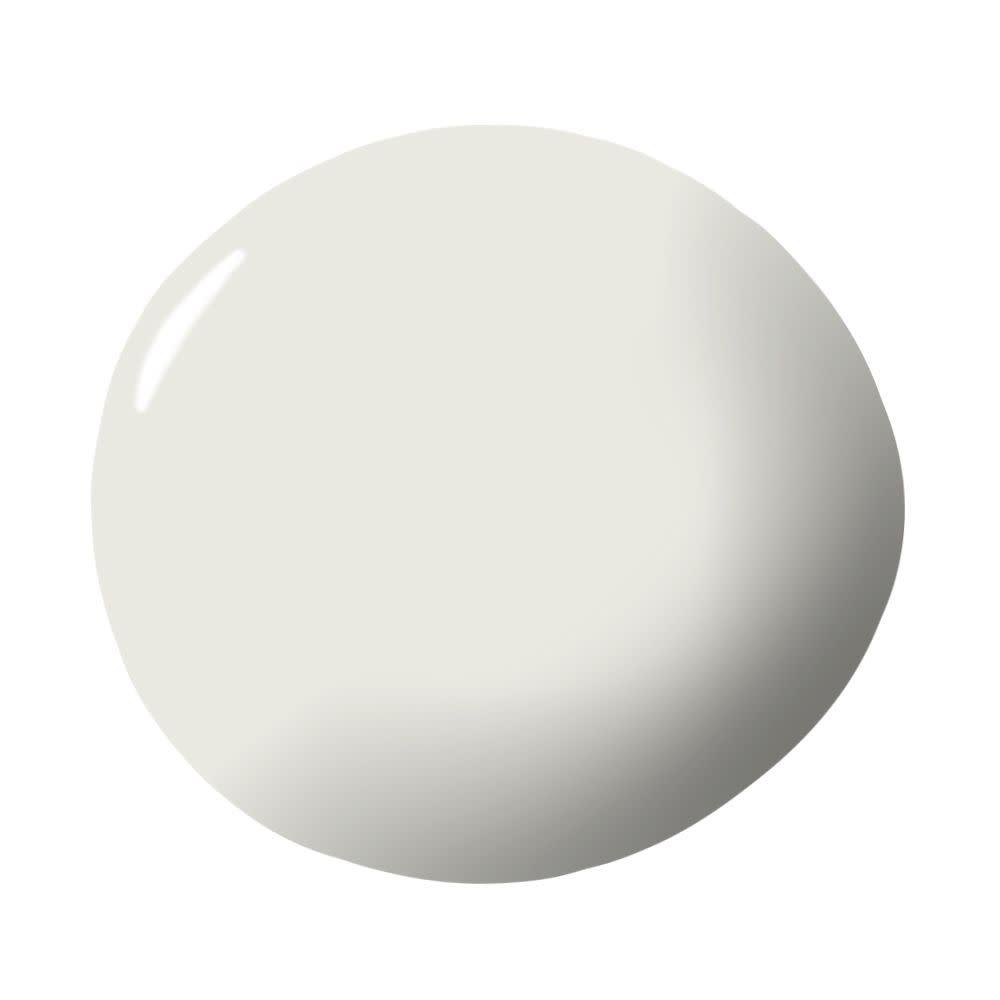
Amazing Gray by Sherwin-Williams
“Amazing Gray is a timeless neutral that that is not too warm or too cool. It has more body and dimension than a builder beige and plays well off of other colors.” — MA Allen
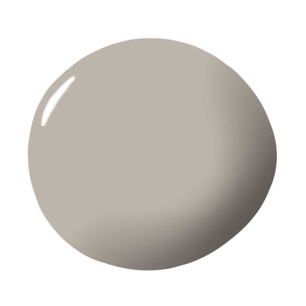
Chantilly Lace by Benjamin Moore
“Chantilly Lace from Benjamin Moore is a crisp, clean white that lends itself equally well in either a modern or traditional home. It picks up the tones in natural lighting and does not interfere with artificial light sources. Art looks amazing against this hue, but it is perfectly fine to be a naked wall.” — Nancy Mayerfield
You Might Also Like
