Facebook: 3 Graphs to Understand Year 1

Even as several European markets are making new highs today, U.S. stocks opened flat this morning, with the S&P 500 at breakeven and the narrower, price-weighted Dow Jones Industrial Average down 0.1% as of 10:05 a.m. EDT.
Facebook: 12 months in three graphs
Saturday marked the first anniversary of Facebook's initial public offering. Here are three charts that tell the story of the company's first 12 months as a public company:
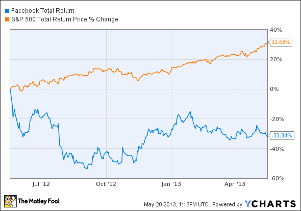
FB Total Return Price data by YCharts.
On an absolute basis and relative to its large-cap peers, Facebook has performed disastrously, losing nearly a third of its value; during the same period, the S&P 500 has returned more than 30% (including dividends). That result isn't surprising if we consider the absurdly inflated valuation at which the company came public: The shares were offered at $38 a piece and closed their first day of trading at $38.23, or 70.1 times the then next 12 months' earnings-per-share estimate. The stock hasn't achieved that price or that multiple since then. I'm not saying this purely with the benefit of hindsight, either -- it was pretty obvious from the outset.
But perhaps you think the S&P 500 is not an appropriate benchmark for a rule-breaking business like Facebook. In that case, here's how the stock has fared against some of its social-networking peers:
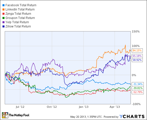
FB Total Return Price data by YCharts.
This chart shows a mixed verdict. Several stocks (LinkedIn, Zillow, and Yelp) have massively outperformed Facebook (and the broad market), which nonetheless managed to beat Groupon and Zynga. It's no coincidence that the latter two were at the top of the hype-meter when they floated; furthermore, their horrendous post-IPO returns, along with those of Facebook, hint at a burst bubble in social-networking shares.
Finally, here's a graph that compares Facebook's performance with that of Google , arguably its greatest competitor. Remember that unless Facebook stumbles across a new business model, both companies are competing for online advertising dollars.

FB Total Return Price data by YCharts.
The difference between the two? Apart from the difference in valuations a year ago, Facebook remains a speculation: It's not clear what the business will look like in 10 years' time. Google, on the other hand, is a legitimate investment with a genuine competitive advantage. Or, as Berkshire Hathaway vice chairman Charlie Munger put it back in 2009:
Google has a huge new moat. In fact I've probably never seen such a wide moat. I don't know how to take it away from them. Their moat is filled with sharks.
That's high praise, coming from one of the smartest investment thinkers out there.
After the world's most hyped IPO turned out to be a dud, many investors don't even want to consider shares of Facebook. But there are things every investor needs to know about this revolutionary company. The Motley Fool's newest premium research report shows that there's a lot more to Facebook than meets the eye. Read up on whether there is anything to "like" about it today and determine whether Facebook deserves a place in your portfolio. Access your report by clicking here.
The article Facebook: 3 Graphs to Understand Year 1 originally appeared on Fool.com.
Fool contributor Alex Dumortier, CFA has no position in any stocks mentioned; you can follow him on LinkedIn. The Motley Fool recommends Facebook and Google. The Motley Fool owns shares of Facebook and Google. Try any of our Foolish newsletter services free for 30 days. We Fools may not all hold the same opinions, but we all believe that considering a diverse range of insights makes us better investors. The Motley Fool has a disclosure policy.
Copyright © 1995 - 2013 The Motley Fool, LLC. All rights reserved. The Motley Fool has a disclosure policy.
