What Moves the Dow Every Day

Call the Dow Jones Industrial Average (INDEX: ^DJI) investing's version of the Dos Equis commercials' "Most Interesting Man in the World." After all, it boldly claims to represent the entire stock market with just 30 stocks. Its managers, also editors of TheWall Street Journal, ambiguously describe the process of choosing its components, sticking to broader terms that leave many investors confused. And without some serious digging, few people ever do decipher the mysterious formula for calculating the index average.
Intrigued by all of this uncertainty surrounding such an important index, I set out to answer three questions:
How is the Dow calculated?
What does the Dow try to do?
Does the Dow work?
Part 1: starting with the basics: the Dow formula
As Foolish colleague Dan Caplinger recently explained, the index has evolved over time. When Charles Dow first created his average, he simply would take the sum of his components' prices and divide by the number of stocks in the average. But that method hit three huge roadblocks: splits, dividends, and substitutions.
Splits and dividends, along with the occasional, necessary substitution, all cause the Dow index number to move without any real changes in the component values. After experimenting with different fixes, the Dow editors devised the Dow Divisor -- a little number that factors heavily into the index's value today. Norman Fosback breaks down its purpose brilliantly in his book Stock Market Logic:
Assume that the prices of the 30 stocks summed to $3,000. Then the 30-stock average price would be $3,000 divided by 30, or $100. If one of the 30 stocks was quoted at $200, but then split 2-for-1 so that its price fell to $100, the sum of the prices would be only $2,900. To maintain the Average at its actual level of $100, the divisor of the Average is systematically altered. Since $2,900 divided by 100 equals 29, the new divisor is set at 29, down from 30, in effect preserving the average price at $100 ($2,900 divided by 29 still equals 100).
That same formula applies today, making the Dow Average really an index, not an average. Here's a mathematical breakdown:
Formula | June 19, 2012 | Final Index |
|---|---|---|
Sum of Components' Prices / Dow Divisor | 1698.6355 / 0.13232 | 12,837.33 |
Numbers rounded slightly. Calculations based on data from Yahoo! Finance and author's own calculations.
On June 19, 2012, the sum of the components reached 1,628.16. When divided by the Dow's divisor, 0.132, the market average closed at 12,837.33 Notice, too, that the divisor became quite small over time. As splits and substitutions played increasingly larger roles over the years, the divisor shrank so much that it now causes the index to expand.
The Dow's daily movements reflect an interesting ramification of this formula: Only component price changes can move the index number. According to my calculations, if IBM gained only 4% and the rest of the Dow components traded flat, the Dow could close unchanged even if banking giant Bank of America went bankrupt! Surprised? You shouldn't be. Take a look at the discrepancy between the relative weights of these two components:

Of course, if Bank of America did declare bankruptcy, the rest of the Dow components would plunge, too. The Lehman Brothers collapse in the 2008 financial crisis proved that point a little too well.
Part 2: What the Dow says it does
Before the Constitution was written, there wasn't a great deal of "United" in the United States. Distinct states with drastically different foundations and goals realized a huge benefit in finding some way to represent their mutual welfare. To do this, each section sent a group of representatives to the Constitutional Convention. The amount of representatives varied by size of the state, but the meetings between the states, which led to the formation of Congress as we know it, formed a more cohesive picture for the nation as a whole.
The Dow average truly does parallel that Congressional framework. Like Congress, it often fails, and rarely do people say it does an outstanding job. But in theory, it takes the different industries of the U.S. markets and gives each of them one or two representatives, painting a picture of how the market performs overall.
According to the Dow's website, the Dow aims "to provide a clear, straightforward view of the stock market and, by extension, the U.S. economy." The Dow editors pull varied, blue-chip stocks. The status of these stocks, in theory, will provide a microcosm of the entire market, and the high trading volume provides instant feedback. From there, investors can glean the type of market in which they are investing. Charles Dow used this analogy to explain the Dow's usefulness. From the Dow website:
He compared his average to placing sticks in the beach sand to determine, wave after successive wave, whether the tide was coming in or going out. If the average's peaks and troughs rose progressively higher, then a bull market prevailed; if the peaks and troughs dropped lower and lower, a bear market was on.
The Dow also offers some historical context. The same divisor that causes the index number to seem so random keeps the Dow trading at a rate consistent with past results. Of course, inflation can skew results, too, but investors gain incredible perspective when they realize the Dow traded well under 4,000 points just 20 years ago today.
Part 3: Does the Dow work?
Take a look at these two graphs:
A.
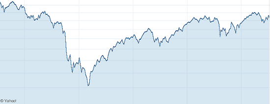
B.

Yes, this is a five-year sample of index prices, but no, I didn't show you the same chart twice. Graph A traces the S&P 500 (INDEX: ^GPSC) , and Graph B represents the Dow. Even though many investors would consider the S&P 500 to be a leading indicator, the Wall Street Journal editors really do capture the overall markets. The correlation between the two tops 90% historically, which shows some consistency between the indices.
The two indices clearly provide a similar synopsis of the overall market's activity, which one would expect given their stated objectives. If a large index weighted on market cap posts similar numbers to a 30-stock index based on price, and the two reach similar conclusions, then the underlying story should be fairly close to the truth.
Executive Director of the Dow Jones Indexes John Prestbo does acknowledge the possibility that future issues could arise. In a remark describing the more recent variance between the two indices, he notes, "If current trends continue unabated, we will have to take action." But for now, the index reflects market trends, and Prestbo remains in lockstep with the Dow's overall mission: "All 30 stocks must work together to tell the story of the stock market."
A longer-term comparison between the Dow and the S&P (1998-2012) does suggest that at least one of the indices may eventually need a slight modification:
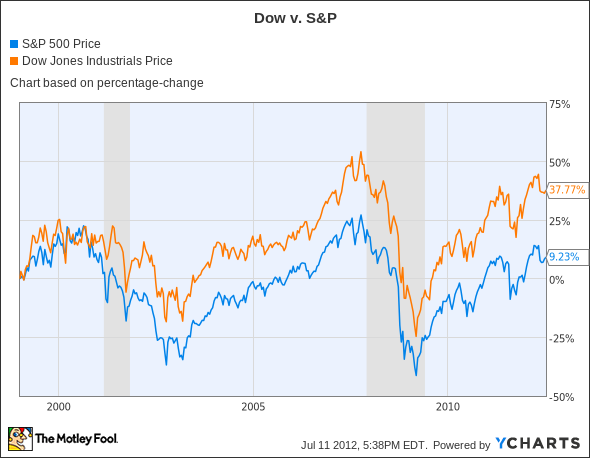
The change does begin to show a somewhat large discrepancy (almost 30%), but considering the time period -- and an almost non-existent discrepancy the previous five years -- this could be a bit misleading. With the power of compound interest, that means only about a 1.25% annual difference for the period. Both indices can move that amount on a daily basis, so from a long-term standpoint, that discrepancy actually looks relatively small. The two clearly rise and fall at the same places, and it becomes more a measure of scope than indications.
The Dow also makes sense relative to GDP. Investment levels and GDP growth do not always correlate, but as a general trend, the two should move in similar directions. After all, investment is a component of GDP. For an 18-year period between 1993 and 2010, GDP and the Dow either increased or decreased their growth rate together more than 70% of the time. This statistic proves nothing, but the numbers fall in the range that seems appropriate between relatively stable markets and a steadily growing economy.
What I found
Is the Dow archaic? Yes, but as it turns out, that's OK. It still works and still has a good feel for what it tries to accomplish. As always, we might expect some changes in the upcoming years to reflect adjustments in different industries. The U.S. always has had and probably always will have a dynamic set of economic demographics.
Maybe it's blind luck, or maybe the editors truly do have that magic feel for the markets. Does Microsoft's position as the 23rd heaviest stock despite having the second-highest market cap make sense? Probably not. But a timeless indicator that compares current economies to history, all while maintaining a pulse on the daily markets? As many credit Bert Lance with saying, "If it ain't broke, don't fix it."
At the time thisarticle was published Will Chavey owns no shares of any stocks mentioned in this article. The Motley Fool owns shares of Bank of America, Microsoft, and IBM.Motley Fool newsletter serviceshave recommended buying shares of Microsoft, creating a bull call spread position in Microsoft, and creating a synthetic long position in IBM. We Fools don't all hold the same opinions, but we all believe thatconsidering a diverse range of insightsmakes us better investors. Try any of our Foolish newsletter servicesfree for 30 days. The Motley Fool has adisclosure policy.
Copyright © 1995 - 2012 The Motley Fool, LLC. All rights reserved. The Motley Fool has a disclosure policy.
