7 Really Important Charts From Obama's Economic Report

President Barack Obama's economic team released a massive 447-page report (link opens PDF) on the economy last week. The introductory text describes what you might expect from such a report: The economy is weak. We'd like it to get better. Here's how we think we'll do it. There isn't much in the way of new ideas or proposals, which is why it hasn't made many headlines.
But there's one truly great part of the report. Alan Krueger, the new chairman of the Council of Economic Advisers, is intensely data-driven. It shows in the report, which is peppered with dozens of tables and charts analyzing every corner of the economy. Here are seven that caught my attention.
1. Behind the falling labor participation rate for young workers
The labor force participation rate -- the percentage of the working-age population that has a job -- has been in steep decline lately. And the drop far predates the recession. It's been falling consistently since the late 1990s (although the pace of decline picked up in the past few years).
This is another sign of how weak the jobs market is. But is there something else going on? Fewer young adults are working, but more than ever are enrolled in college. As the labor participation rate for young workers fell during the last decade, the educational enrollment rate went way up:

This isn't necessarily a positive sign. I have several friends who went back to school because they couldn't find work; education was a good alternative to keep them busy. But part of it does reflect a broader trend. Nearly 30% of Americans over age 25 now have a bachelor's degree, up from less than 10% in 1960. As post-secondary school becomes more common, it's only natural that the percentage of young Americans not working will rise.
2. So much worse than the Great Depression
If you thought the recent housing bust was unprecedented, you're right. It was far worse than even the Great Depression:

These figures are in real (inflation-adjusted) terms, so there is some skewing. Housing prices fell hard during the Great Depression, but so did everything else -- wages, commodities, etc. What's been unprecedented about our recent crash is that home prices collapsed while the prices of almost everything else either rose or recovered quickly. The aggregate consumer price index is up about 10% since 2007, yet the S&P Case-Shiller housing index is still down more than 30% from its peak.
3. Education: It pays
Median real income for working-age households has declined over the last decade and risen only moderately over the last several decades. But those numbers quickly change when you break it up by group. Workers with a bachelor's degree or higher have seen their paychecks rise nicely, while those without -- particularly those lacking a high school diploma -- have seen their pay fall hard:

There's a good chance this trend will continue. As economist Justin Wolfers pointed out yesterday, Monster.com recently posted more than 1,000 jobs listings in the Pittsburgh area. Only two didn't require a high-school diploma.
4. It really, really pays
This chart shows the same phenomenon:
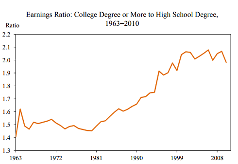
The relative benefit of having a college degree has exploded over the past 30 years, mostly as the economy moved from unskilled manufacturing to knowledge-based industries. The rising cost of tuition has offset part of the benefit, but not all of it. The cost of obtaining a college degree has grown slower than the cost of not having one.
5. Remembering the 1990s
This chart is only relevant in stating the obvious: The 1990s were really good, and the 2000s were pretty awful:

Rising health insurance costs explain some of why income growth was so poor last decade. Total compensation growth over the last decade was actually decent, but almost all of it came in the form of employers paying for higher health-insurance premiums. In 1990, employer-provided health insurance made up less than 6% of workers' compensation. By 2000, it was about the same, at 5.9%. Today, it's 8.4% and growing virtually every month.
6. The fine line between job creation and destruction
Last month, Holman Jenkins of TheWall Street Journal wrote something fascinating:
Between 1977 and 2005 ... some 15% of all jobs were destroyed every year, even as total jobs grew by an average of 2% a year. Job creation and destruction are both relentless. ... The small difference between the two is what we call prosperity.
The president's report goes into more detail. Here's how this looks over the past 30 years:
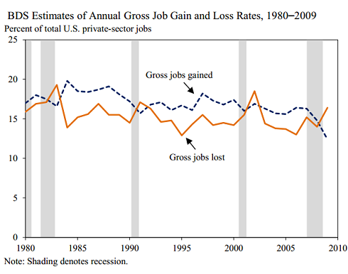
What's interesting is that job destruction never got particularly high during the recession -- it never even breached levels seen in 2002. What was so painful about 2008 and 2009 was not the number of people losing their jobs, but that those who lost jobs couldn't find new ones. In fact, the number of people being separated from their jobs is now near the lowest level of the last decade.
7. Rise of the 1%
This chart speaks for itself:

Stats like these often elicit emotional reactions that fall into one of two groups: Either you think it's a sign of all that's wrong with America or is the propaganda of class warfare.
But try to suspend judgment for a moment. Ask some important questions: Why did the earnings of the top 1% fall so hard, flatline for half a century, and then shoot back to the former high? Was it entrepreneurship? Regulation? Taxes? Wall Street? Something else? The answers aren't clear, but a chart like this shouldn't be ignored. It tells too important a story to be treated as an emotional sound bite, regardless of which side the bias comes down on.
What do you think of these charts? Let me know in the comment section below.
At the time thisarticle was published Fool contributor Morgan Housel doesn't own shares in any of the companies mentioned in this article. Follow him on Twitter @TMFHousel. Try any of our Foolish newsletter services free for 30 days. We Fools may not all hold the same opinions, but we all believe that considering a diverse range of insights makes us better investors. The Motley Fool has a disclosure policy.
Copyright © 1995 - 2012 The Motley Fool, LLC. All rights reserved. The Motley Fool has a disclosure policy.
