Reconsidering the "New" BRICs

A few weeks ago, I published an article reviewing the performance of the stock markets of 16 nations -- including all the BRICs -- for the first 10 years of the 21st century. The analysis showed that while Russia (far and away No. 1), India (No. 3), and Brazil (No. 4) all performed strongly, China was well down in the pecking order (No. 12).
The stock markets of Mexico (No. 2) and South Korea (No. 5) also performed well enough to be included in the top tier. So my conclusion was that going into the second decade of the century, instead of just tracking the BRICs, investors should keep their eyes on the "McRIBS." (China got a small "c" because, unlike the other five, simply buying a large-cap exchange-traded fund that tracks its overall stock market has not sufficed to provide U.S. investors with returns commensurate with the Chinese growth story.)
But...
An astute commenter pointed out that my analysis hadn't factored in the decline of the dollar. The commenter stated that the dollar had declined 20% in value in the first 10 years of the century -- it turns out that inflation from 2001-2010 inclusively actually amounted to a cumulative 21% -- and thus, he complained that the chart showed the S&P 500 value as flat for the decade (a compounded annual growth rate of fractionally less than 0%) when in reality the absolute value of an investment in the S&P 500 from 2001 to 2010 would have been down by 20% or so.
Now, all the bourse indexes were valued in terms of the nominal value of their respective currencies, so I'd argue the playing field was level. Furthermore, virtually all return-on-investment figures are provided in nominal terms, so if we started taking inflation into account, we would be talking oranges while the rest of the investment world talked apples and it would therefore be confusing and a disservice to the reader.
However, using nominal native currencies over 10 years actually does not necessarily provide a perfectly level playing field, because it ignores currency fluctuations. In looking at the changes in value for each currency relative to the dollar over the decade, these were not insignificant. The following chart shows the relative performance of each of the 16 currencies against the dollar:
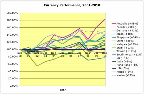
Sources: Yahoo! Finance and author's calculations.
As you'll see, the Australian dollar appreciated relative to the U.S. dollar by 83% from December 2000 to December 2010; the Mexican peso was worth 22% less relative to the dollar at the end of the decade. Obviously, some of these fluctuations are significant enough to make a difference to a U.S.-based investor.
In nominal Australian dollars, the chart from our previous article showed that the Australian ASX 200 Index appreciated by 4% on a CAGR basis from 2001 to 2010. But from a U.S.-based investor's perspective, the 83% appreciation of the Australian dollar against the greenback also counts. Taking that into consideration, an investment in the ASX 200 -- or, practically speaking, the U.S.-dollar denominated ETF that tracks it -- had a CAGR of not 4% but 10% -- a big difference over 10 years!
When the change in the nominal value of the indexes as denominated in each nation's respective currency (including the euro for Germany) is adjusted by the change in the value of that currency relative to the dollar, the CAGR pecking order for the first decade of the century changes a bit:

Sources: Yahoo! Finance and author's calculations.
Russia remains No. 1, and still by a lot. In fact, the same five countries are in the top tier (although Mexico slides down to No. 4). So McRIBS still looks good.
The biggest differences are in the second tier of bourses. Without currency in the calculation, Malaysia (CAGR of +8%) and Taiwan (+7%) were all alone there. But now, there are five countries whose stock markets appreciated 8% to 11% on a CAGR basis from 2001 to 2010.
Originally, there were five countries whose stock markets registered a CAGR of between +3% and +5%; now there are just three in the +4% to +5% third tier, including Germany, which moves up from the fourth and last tier.
Which leaves three trailers: Japan, the U.K., and the U.S. And thanks to the stronger yen and pound, with currency adjustments taken into consideration, the U.S. (S&P 500) performance over the first 10 years of the 21st century drops from 14th to 16th best -- which is to say, last place.
As a reminder, here's a rundown of all the markets in our chart along with the pertinent ETF or ETN:
Country | Market | Symbol (Yahoo!) | Security | Symbol |
|---|---|---|---|---|
Russia | RTSI | RTS.RS | Market Vectors Russia | (NYS: RSX) |
Mexico | SE IPC | ^MXX | MSCI Mexico Index | (EWW) |
India | BSE SENSEX | ^BSESN | India Earnings | (EPI) |
Brazil | IBOVESPA | ^BVSP | MSCI Brazil Index | (NYS: EWZ) |
South Korea | KOSPI Composite | ^KS11 | MSCI South Korea Index | (EWY) |
Malaysia | Bursa Malaysia | ^KLSE | MSCI Malaysia Index | (EWM) |
Taiwan | Taiwan Capitalization Weighted Stock | TAIEX | MSCI Taiwan Index | (EWT) |
Singapore | Straits Times | ^STI | MSCI Singapore Index | (EWS) |
Hong Kong | Hang Seng | ^HIS | MSCI Hong Kong Index | (EWH) |
Canada | S&P/TSX Composite | ^GSPTSE | MSCI Canada Index | (EWC) |
Australia | S&P/ASX 200 | ^AXJO | MSCI Australia Index | (EWA) |
China | Shanghai Composite | 000001.SS | FTSE China 25 Index | (NYS: FXI) |
Germany | DAX | ^GDAXI | MSCI Germany Index | (EWG) |
USA | S&P 500 | ^GSPC | SPDR S&P 500 | (NYS: SPY) |
U.K. | FTSE 100 | ^FTSE | MSCI United Kingdom Index | (NYS: EWU) |
Japan | NIKKEI 225 | ^N225 | MSCI Japan Index | (NYS: EWJ) |
Source: Yahoo! Finance.
So what about inflation?
We are still not reflecting inflation directly here. But adjusting the nominal native currency performance of each bourse to reflect the value of that currency relative to the dollar makes things easy. Adding inflation to the mix to get an "absolute value" would not change the rankings, because all that entails is reducing the decade-ending valuations of each bourse by the same 21%. For example, taking inflation into account would make the absolute CAGR for Russia's stock market 25% instead of 28% (and still No. 1), and it would make the absolute CAGR of the S&P 500 -3% instead of -0% (and still last).
Bottom line: Upon due reconsideration, McRIBS still makes sense as the new paradigm for emerging markets.
At the time thisarticle was published Guest contributor Brad Hessel currently owns shares of iShares MSCI Brazil Index Fund, iShares FTSE China 25 Index Fund, the India Fund, and ProShares Short S&P 500 (which, though not mentioned in the article, effectively makes him short the S&P 500 ETF) and has no position in any of the other equities mentioned; however, Brad's clients may have such positions. The Fool's disclosure policy includes certain trading restrictions that apply to Brad. However, his clients are not subject to our disclosure policy and thus are free to trade any such equities.The Motley Fool has sold shares of SPDR S&P 500 short. Try any of our Foolish newsletter services free for 30 days. We Fools may not all hold the same opinions, but we all believe that considering a diverse range of insights makes us better investors. The Motley Fool has a disclosure policy.
Copyright © 1995 - 2011 The Motley Fool, LLC. All rights reserved. The Motley Fool has a disclosure policy.
