24 Times Companies Messed With Their Iconic Logos

For the nation’s largest companies, it’s hard to overstate the importance of branding. Still, the time inevitably rolls around when higher-ups decide it’s time for a new look that better reflects the times. Here’s a rundown of some of the most notable tweaks to familiar logos — some a resounding success, some definitely not — including Buick, which is not only changing its logo, but its entire automotive line.
Related: Companies Forced to Rebrand to Avoid Being Canceled
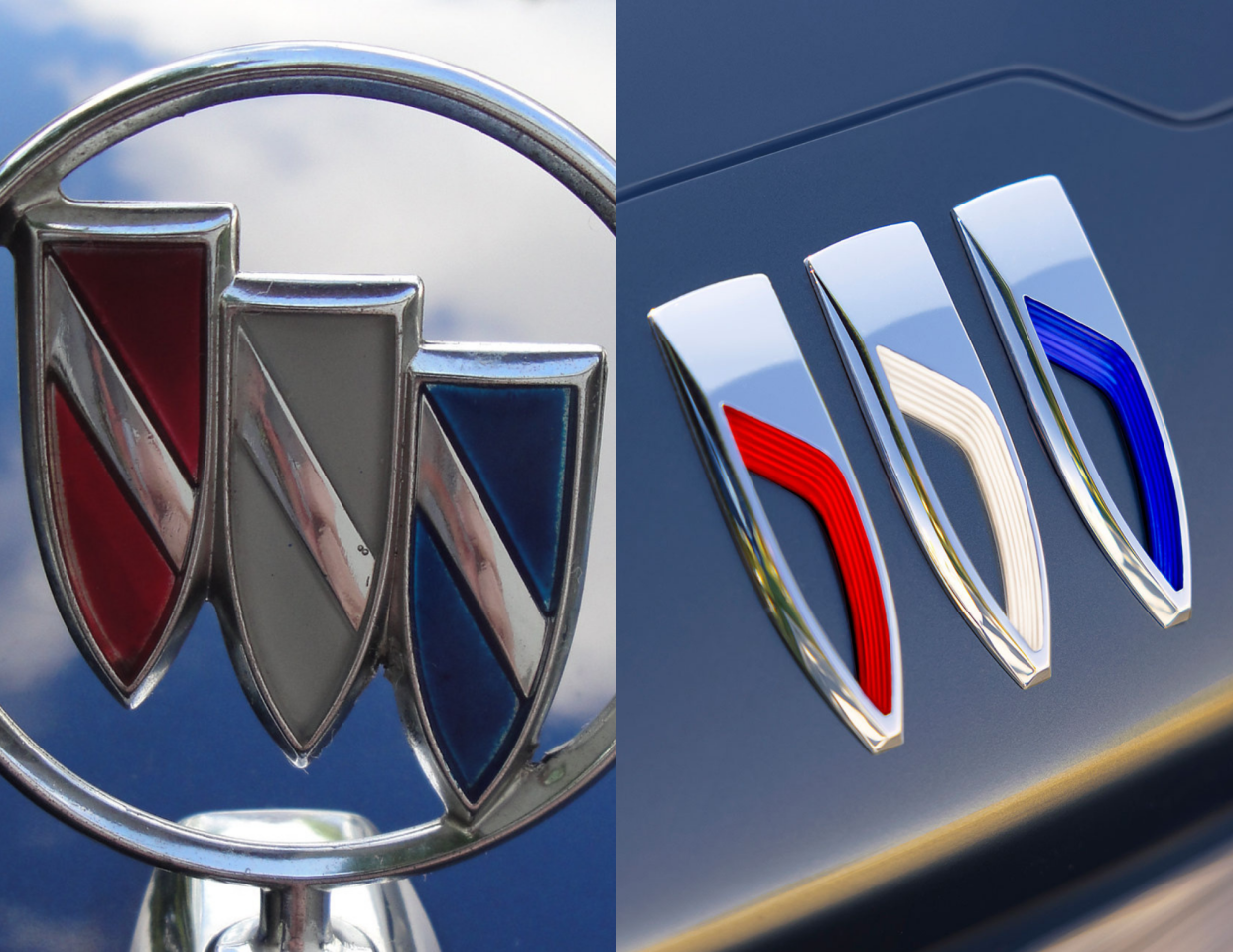
Buick is aiming to completely shake off its staid reputation its staid reputation in the auto industry. The car maker, which is owned by General Motors, has announced that it will only sell electric vehicles by the end of this decade, and it plans to release its first EV in 2024. They will carry the name "Electra" and sport a new logo that ditches the circular symbol in favor of sleeker body-mounted red, white, and blue shields.
Related: The Surprising Reasons These Companies and Brands Changed Their Names
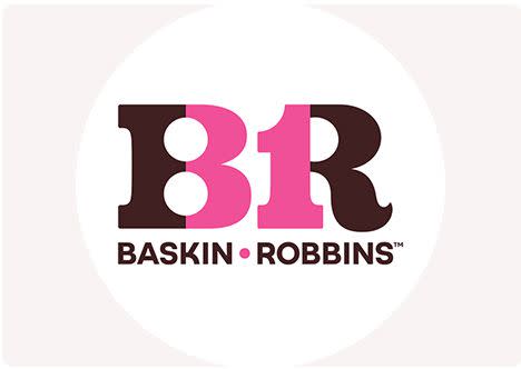
Baskin-Robbins is channeling a more sophisticated look for its logo. The ice cream company’s new design veers away from the playful font it has used for years and embraces a crisper, simpler aesthetic. Gone is the childlike pink and blue font, and in its place, a more "grown-up" vibe with color combinations including pink and white, pink and brown, and blue and brown. The logo isn't all that's changing, though. Baskin-Robbins will also unveil some new flavors and start selling merchandise including bicycles and bucket hats.
Related: I Tried Cannabis-Infused Ice Cream — Here's What Happened
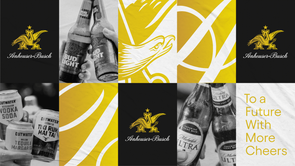
Anheuser-Busch is giving its logo a more premium look. The beer company’s new design features its famous eagle now facing the right, not left, to represent looking toward the future. Gone is the red, replaced with a gold color scheme that is supposed to represent shades of beer and barley. Branding experts give the effort mixed reviews, telling Adweek that the luxe script might be too fussy in a digital age that trends toward simpler logos.
For more stories like this, please sign up for our free newsletters.
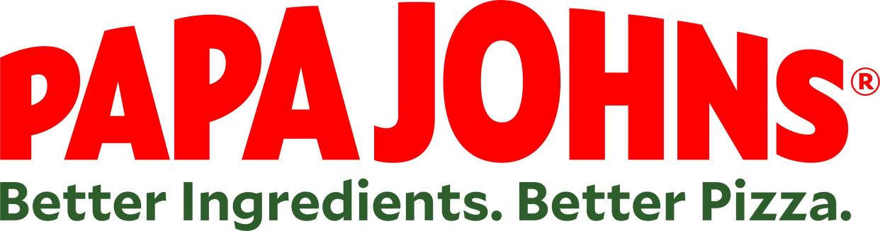
What's in a name? If you're Papa Johns, the question is what's not in the name any longer: an apostrophe. It may seem like an insignificant (and grammatically incorrect) change, but dropping the apostrophe is another way the pizza company is distancing itself from founder and ex-CEO John Schnatter, who resigned after using a racial epithet on a conference call in 2018. Moral of the story: The company is no longer John's, so the possessive doesn't make sense. The redesigned, apostrophe-free logo is part of a full rebrand that started two years ago and includes new store designs and color schemes, all symbolically moving the company away from its disgraced founder — and, hopefully, its sales slump.
Related: Jeff Bezos and Other High-Profile CEOs Who Stepped Down From Their Companies
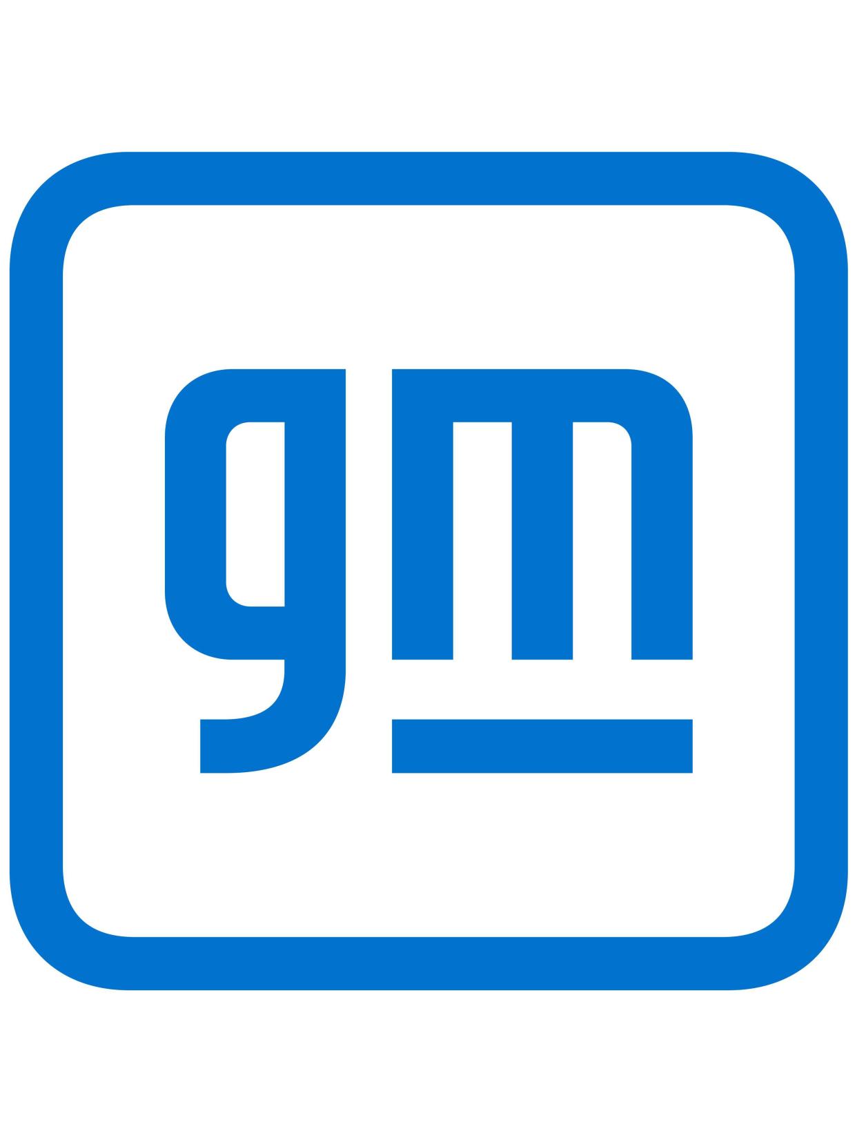
In one of the most notable recent logo redesigns, GM swapped out its dark blue box and capital “GM” for an airier white box with light blue, lowercase letters. The change, only the fifth logo tweak in the automaker’s 113-year history, is a nod to more futuristic thinking, including a big focus on electric vehicles. Of course, the change was met with some raised eyebrows: “Looks like Windows Word art from the 2000s," one Twitter user groused.
Related: The Bestselling Electric Cars in America
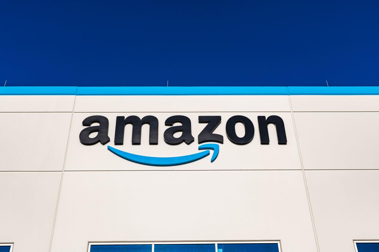
Surely there could be nothing controversial about Amazon switching out its shopping-cart app icon in favor of a boxlike icon with packing tape, right? Unfortunately, what was supposed to be a minor logo redesign for the ecommerce giant became a major cautionary tale when Twitter users pointed out that the new icon resembled “Cardboard Hitler,” complete with a bushy blue mustache. Needless to say, the icon quickly got another update.
Related: Things You Should Never Buy on Amazon
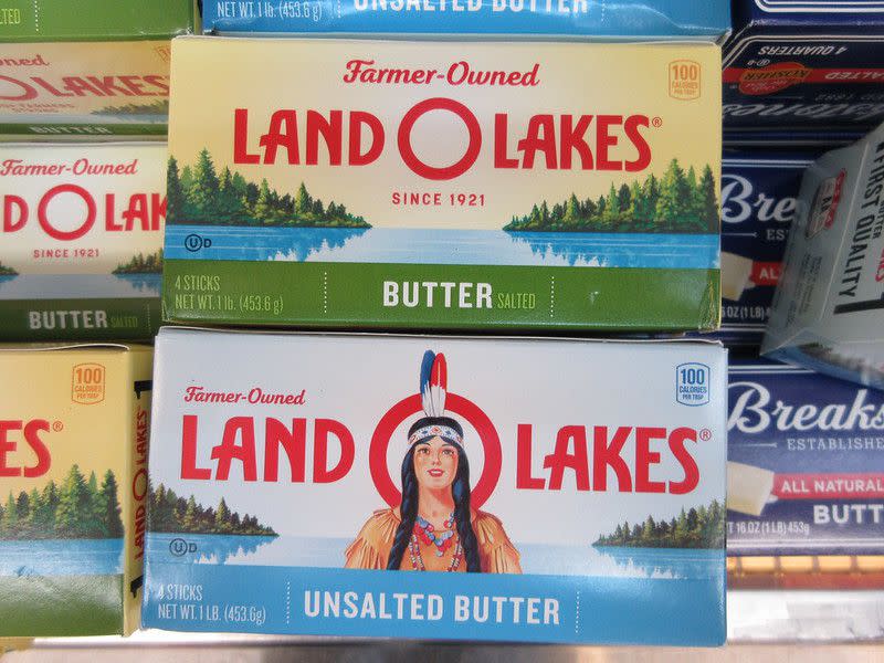
Notice something different about your butter? Land O' Lakes redesigned its logo in 2020, leaving off the Native American woman who had been on its packaging for nearly 100 years. While the brand publicly said the changes were meant to emphasize its relationship with dairy farmers, most observers saw the rebranding as a convenient way to get rid of an "embarrassing, outdated, and downright racist" logo.
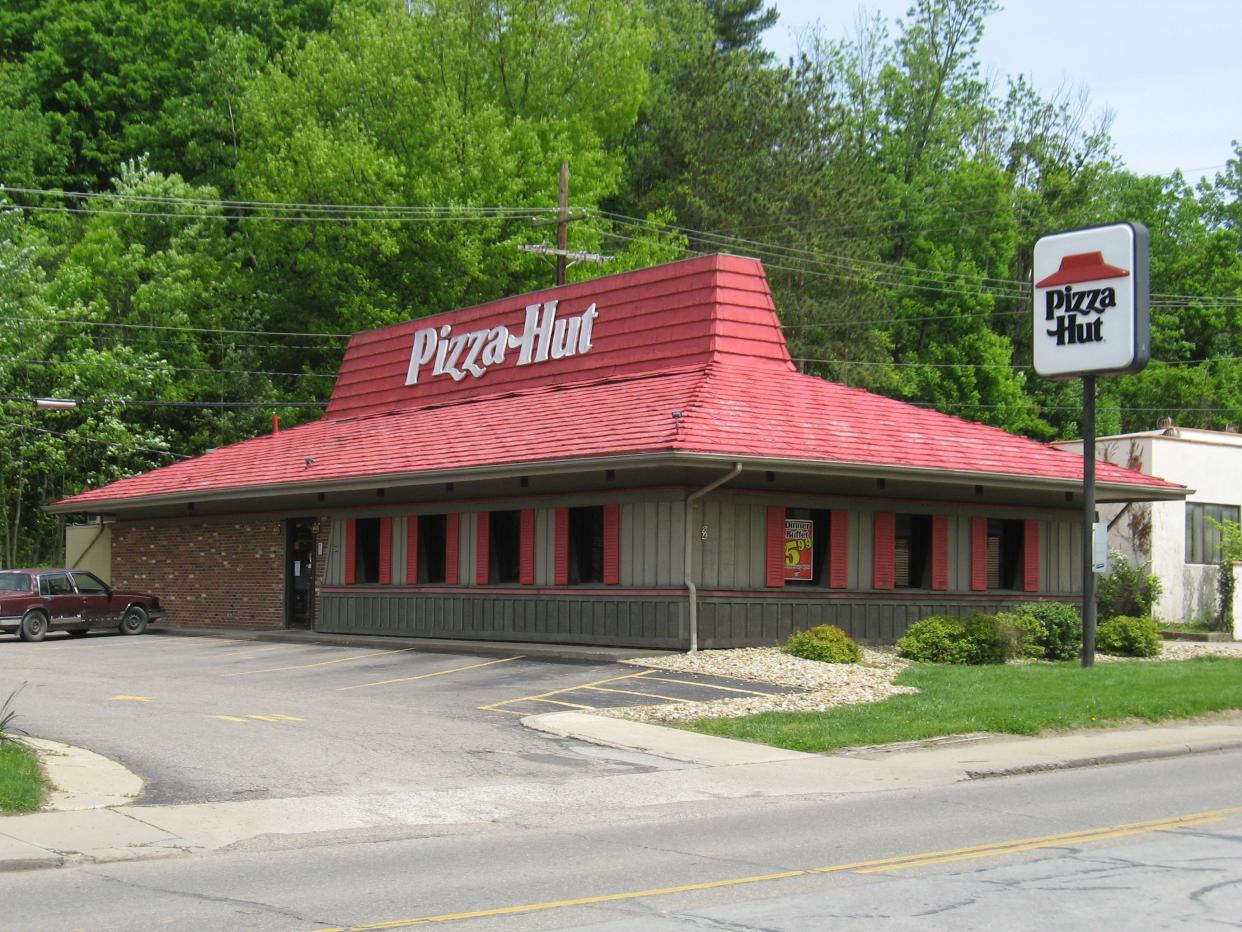
If it ain’t broke, don’t fix it: That was Pizza Hut’s thinking, anyway, when it decided to make everything old new again in 2019. That’s when the massive pizza chain decided its classic red-roofed logo with the traditional black script would get a second life, appearing alongside or in place of the chaotic, swirling red circle that has been its logo since 2014. It’s an interesting strategy, considering the company has actually been shutting down many of those red-roof dine-in locations.
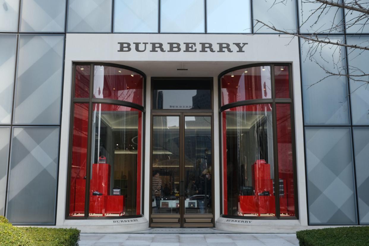
Luxury brands have to be particularly careful not to turn off well-heeled customers who are accustomed to a certain look, but that didn’t stop Burberry from making a major change in 2018. Gone was the equestrian knight and stuffy, squashed serif font; in its place, bold sans serif. Though it received some predictable criticism that it was too simple (“like it’s been done on Microsoft Word”), most observers acknowledged that it made sense for a brand making a play for younger, trendier customers.
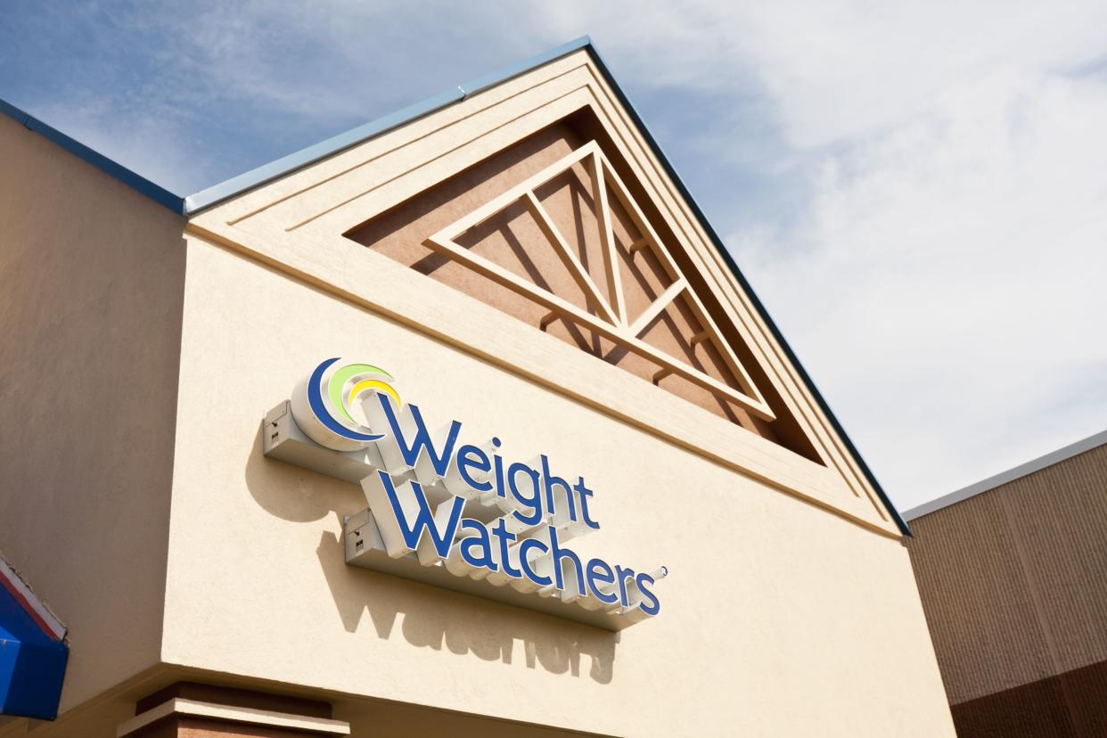
By 2018, “diet culture” was on the outs and Weight Watchers was well aware that it needed to keep up with the times. It settled on not just a new logo, but an entirely new name: “WW.” The new slogan? “Wellness that works” — no mention of weight loss. The changes met with mixed reactions but have stuck around. But as one critic says, “If the company actually wants to make its customers healthier, it’s going to have to do more than change its name.”
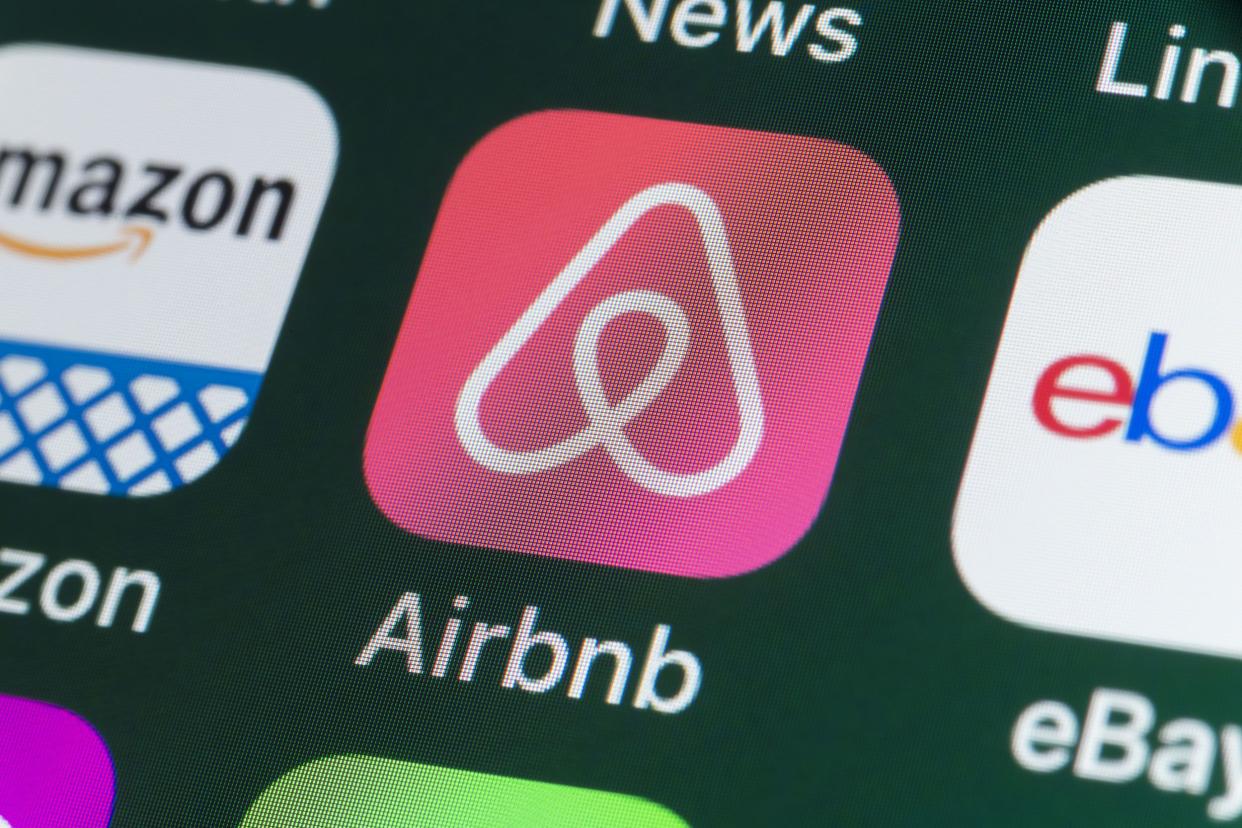
The now-ubiquitous rental platform wasn’t quite so entrenched when it unveiled its new logo in 2014. Remember, if you will, the old design: Puffy, whimsical white letters outlined in blue, which gave way to today’s “belo,” a symbolic gesture toward belonging, the company has said. Of course, the internet had jokes, comparing the nebulous swooping logo to a bevy of body parts, but there were also more serious issues about whether the new design was too similar to other companies’ existing logos.
Related: Is Plum Guide the Next Airbnb?
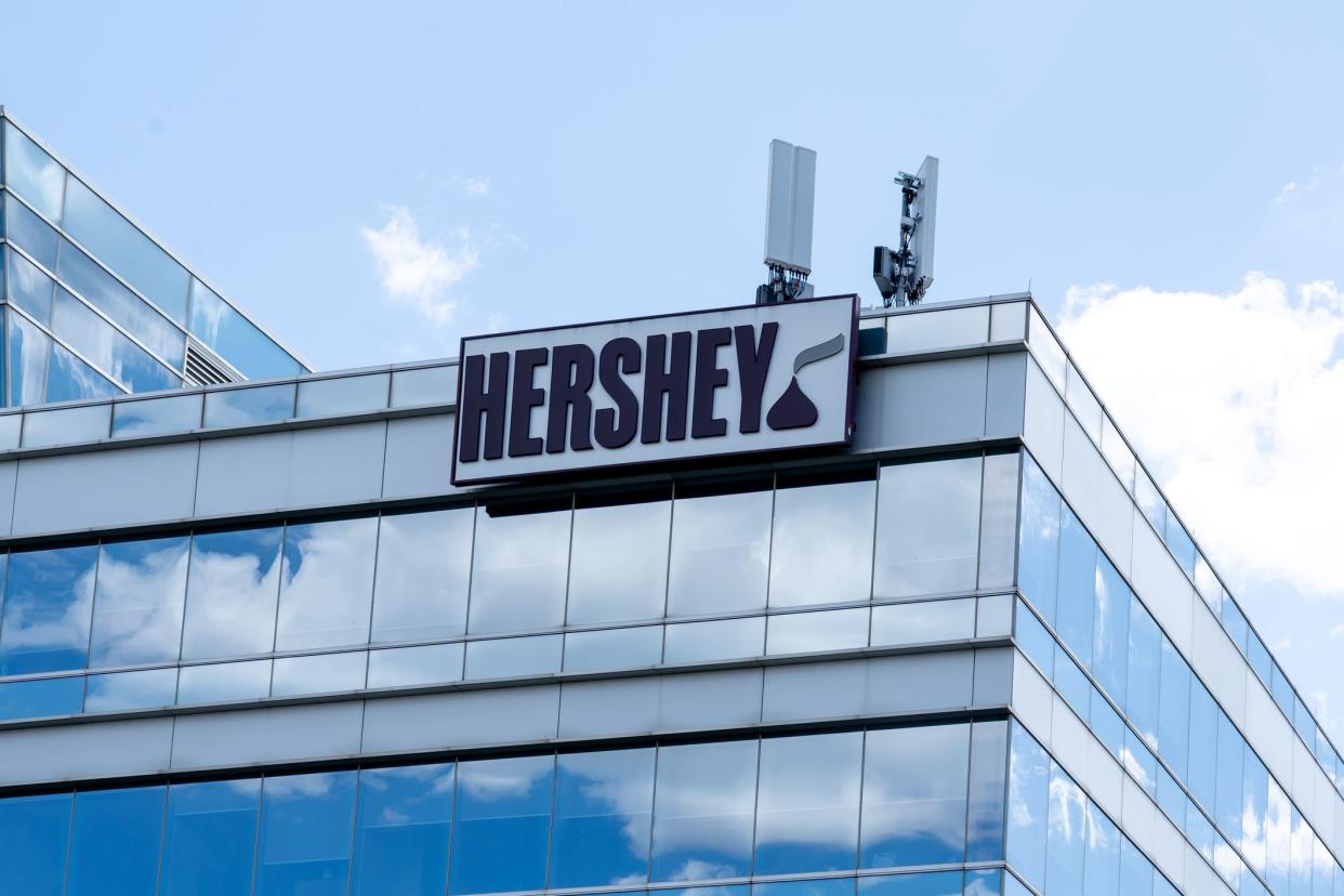
You have to hand it to Hershey: The company didn’t bail on its new logo, unveiled in 2014, even after several observers pointed out that the unwrapped Hershey kiss at the end was essentially a poop emoji minus the eyes. The redesign was meant to evoke a more global sensibility than Hershey’s old logo, which included a 3D wrapped Kiss and a more traditional serif font.
Related: Surprising Things You Didn’t Know About Hershey’s Kisses

In 2013, American Airlines was more than ready for its first-ever logo change. It was emerging from bankruptcy and absorbing US Airways, so the time was ripe for a new look. Gone were the double A’s and stylized eagle; in their place, a modernized red and blue airplane fin bisected by a vaguely eaglelike silhouette. By now, we’re all used to the new look, but it met with some criticism at the time (one critic called it “a linoleum knife poking through a shower curtain”) and the U.S. Copyright Office even refused to protect it until 2018, saying it lacked the creativity necessary for a copyright mark.
Clearly, people have strong opinions about corporate logos, so Yahoo decided to play on that by teasing its users with 30 days of potential new designs before finally revealing its new look in 2013. It was actually Yahoo’s third logo — recall the original red serif with a drop shadow, so reminiscent of the early internet — and it would not be its last. Yahoo unveiled yet another logo change in 2019, with thicker letters and a particularly slanted exclamation point. The Verge, for one, sneers that it’s less about corporate identity and more about reminding us that Yahoo still exists at all.
It’s hard to remember now, but more than a decade ago the Windows-inspired multicolored squares synonymous with Microsoft were nowhere to be found, and the logo was simply the company name in nondescript Helvetica italics. Though some found the new look bland, the change was generally well received, and seen as a way to make sure Microsoft maintained relevance in the face of shinier, edgier tech competitors including Facebook, Google, and Apple.
Related: Successful Business Launched During Economic Downturns
The ubiquitous coffee chain has been through a handful of logo redesigns since its founding in 1971, arriving at today’s wordless green-and-white mermaid in 2011. The new design was seen as a risk — was the brand entrenched enough that its symbol didn’t even need to say “Starbucks”? — but as history has shown, worries were unnecessary. The new look also helped Starbucks bounce back from a 2008 throwback to the chain’s original bare-breasted mermaid that was derided as too racy.
Related: Things You Didn’t Know About Starbucks
If Gap’s logo looks the same to you as ever, that’s because this redesign was not long for this world. The iconic fashion brand sought to become “modern, sexy, and cool” with its 2010 logo redesign, which shrank the big blue box and used a bland Helvetica font in place of the classic white serif. The new logo lasted all of a week before Gap gave in to a massive online backlash and reversed course.
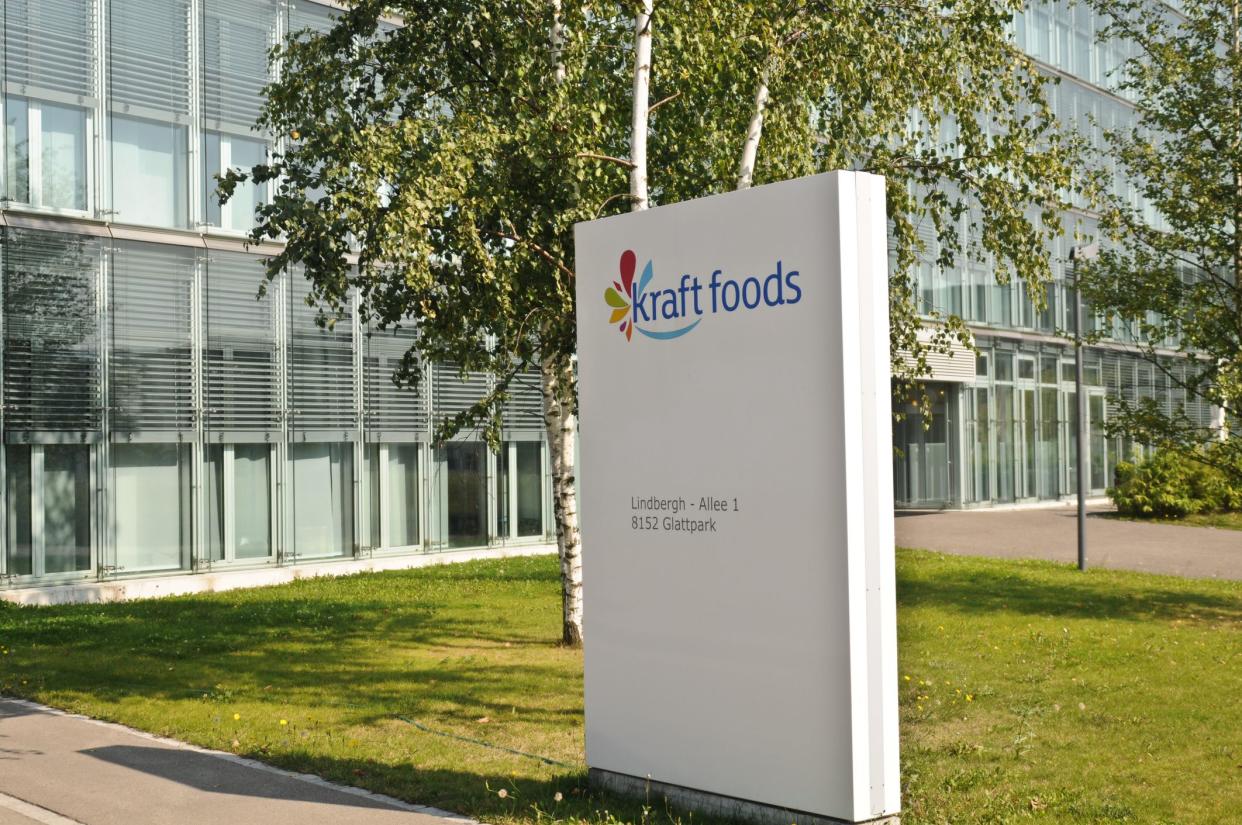
Kraft’s 2009 logo swap remains one of the more prominent cautionary tales when it comes to rebranding, and it’s a fixture on at least one list of worst-ever logo redesigns. Kraft blew up its classic red ring with blue letters completely, settling on a weirdly flowery, uber-corporate mishmash in its place — presumably to evoke a healthier image. A few years later, Kraft was back to a modified version of its old logo, finding out the hard way that it’s dangerous to mess with a classic.
Related: Fun Facts You Didn’t Know About Mac and Cheese
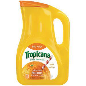
Looking for orange juice? Your choices will almost always include a familiar white carton with green lettering and a straw sticking out of an orange. But in 2009, Tropicana decided to get edgy, chucking its traditional packaging in favor of something much more modern, even smoothing out its green letters and taking them vertical. Two months later, customers were confused, sales were down 20%, and Tropicana switched back to its old look.
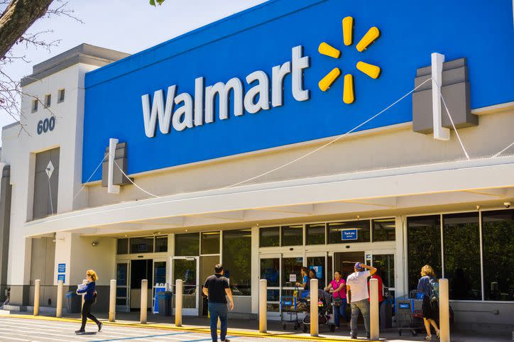
Walmart is well aware that it’s one of the most polarizing retailers out there, and in 2008, it set out to create a more trustworthy image. Its old logo, made up of stark dark blue capital letters, gave way to a lighter blue, a more modern font, and the now-iconic yellow spark. The response was largely positive, and “led to a brighter, friendlier, and more modern store and shopping experience,” according to DesignRush.
Related: Why Some Shoppers Hate Walmart
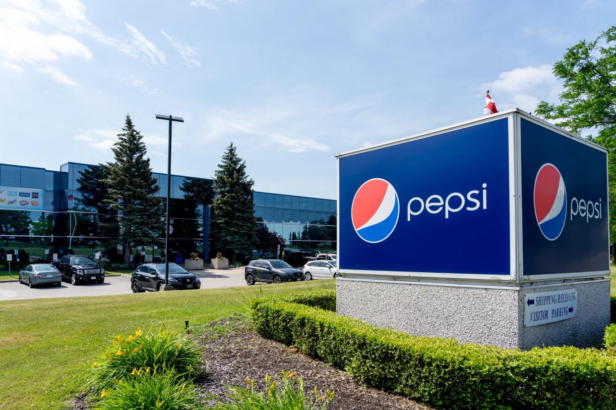
While rival Coke has kept its branding relatively consistent over the years, Pepsi has been all over the map. Its last major shakeup was in 2008, when it famously took its red and blue globe and tipped it on its side. The $1 million rebranding has stuck around, but definitely got its share of flak. “It looks like some strange foreign knockoff of Pepsi — Pipse, maybe. I’m pretty sure I hate it,” wrote one L.A. Times critic. Others even blasted Pepsi for borrowing a little too liberally from then-Sen. Barack Obama’s 2008 campaign swag.
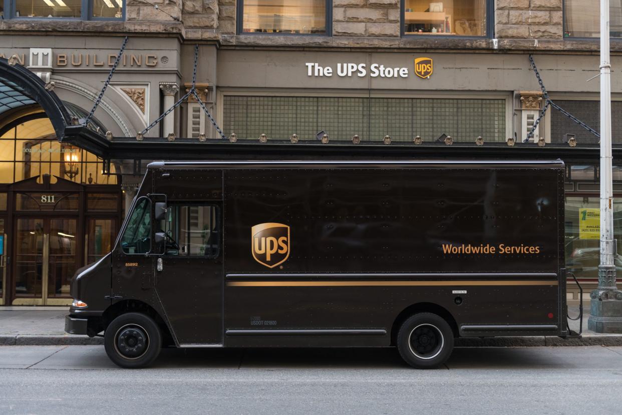
This shipping giant is so synonymous with the color brown that it’s hard to remember its logo used to be a yawn-inducing black and white, all the way from the 1960s until 2003. That’s when UPS embraced its gold and brown shield, seen on its tens of thousands of delivery trucks across the nation. It was a solid effort, according to Logaster: “Standing for strength and reliability, an image like that has a profound effect on the audience. The color palette of gold and brown lends a further sense of stability to the emblem.”
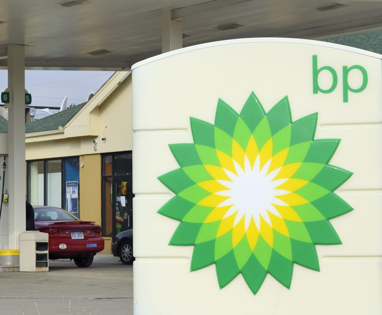
BP embarked on a redesign in 2000 that has stuck around despite persistent criticism. It kept its green and yellow color scheme, but replaced the shield with a helios “whose interlocking parts represent the diversity of our people, products and services.” Critics have said the logo represents a blatant attempt to make a fossil-fuel giant look more eco-conscious, and Greenpeace even solicited its own redesigns in the wake of the company’s disastrous Deep Horizon oil spill.
Related: Companies’ Most Cringe-Worthy PR Fails
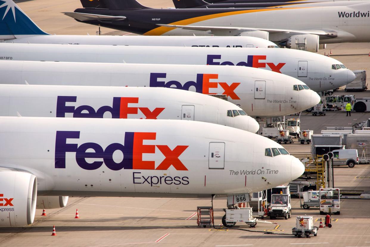
In the mid-’90s, FedEx unveiled one of the more successful logo redesigns in recent history. The company was looking to drop the laborious “Federal Express” name, and its bold new logo cemented the transition to a sleeker corporate identity. In fact, the design has won more than 40 awards and features a clever hidden arrow in the white space between the “e” and the “x.”
